|
You are here: Case Study, Tug Pegasus ~ Site Analysis
FAST's Analysis of Related Sites
This page is the competitive analysis we did for the Tug Pegasus Preservation Project.
Steam Tugboat Site
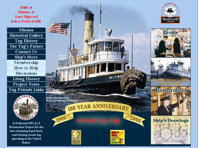
What works:
- The many links on the left and right imply that you can find oodles of information on the site.
- The photo of the tug is dynamic and makes you want to hop onboard with the people already there.
- The medallions ("Port of Baltimore," "Baltimore Museum of Industry," "Maritime Web Award") indicate that the site and the tugboats are tied into a wide community of interest.
- Ship's drawings are like catnip to boat restorers.
- The site honors text-size changes (View > Text Size).
- Text pages change size gracefully.
What doesn't work:
- The different colors of text and background in the left navigation make the menu busy and harder to read.
- If the designers wanted to highlight "Membership," "How to Help," and "Discussions," they could have simply put them first on the list.
- The photos that create the right-hand menu are too busy and the depths of field are all different.
- If you print a text page (not shown here), the text on the right is cut off.
The Gallery of Other Historic Tugs
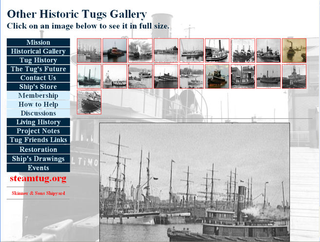
What works:
- It's easy to navigate among the thumbnails.
- The instructions are clear: "Click on an image below to see it in full size."
- There are many photos to choose from.
What doesn't work:
- Many of the photos have no captions or additional information.
- There are no callouts or ALT text ("hover help") to let you know what the photo is before you select it.
- The background image makes it hard to read the text when there is a caption.

New York Fireboat
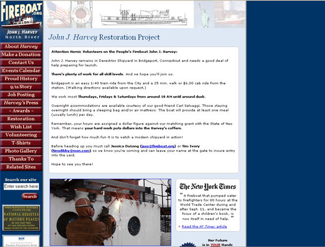
What works:
- The left navigation is clear and organized by importance.
- The logo and colors are attractive.
- The site honors text-size changes (View > Text Size).
- The pages print out correctly because the page width is fixed at the width of a printed page.
What doesn't work:
- The text at the top of the home page is not compelling to look at. It would be better to have the photos, currently below the fold (the bottom edge of the screen, which is cut off on most people's screens), at the top, with a linked banner or some other element above the photos asking for volunteers. For example, "News: Come on board!" or "We need your help. Click here for more information." See the Mariner's Museum for a better way to ask for help.
- Because the designers used fixed-width tables, the text pages do not change size gracefully. On the other hand, the pages do print correctly.
Note: There are better ways than using tables (fixed- or variable-width) to set up pages so they print and resize well--see "Elastic Design" and "Redesign Notes 1: Width-based layout" for more information.
Fireboat Volunteer Page
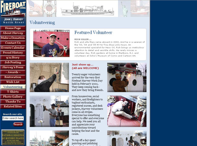
What works:
- The "Featured Volunteer" puts a face on volunteering. "You, too, could be one of us...." One of the interesting things about working on the Ship Wavertree twenty years ago was the variety of jobs and backgrounds people brought to the project. Also interesting was that no one volunteered the information.
- The photos show the variety of work involved and the many different types of people who volunteer on the ship.
- Below the fold is a section on volunteer training options in line handling, welding, riveting, diesel engine repair, and other useful skills for people in office jobs.
Everything works on this page. We'll happily steal some of the ideas.
Redhook Waterfront Museum
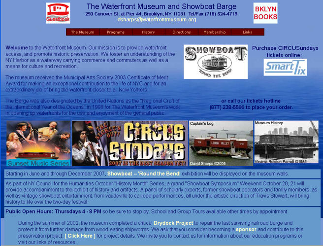
What works:
- With all the logos of related organizations and shows, it's clear that there's a lot going on at the museum. It looks very lively.
- The contact information is right up front, at the top.
- The site honors text-size changes (View > Text Size on the browser itself).
What doesn't work:
- The dark blue text is unreadable on the dark blue water.
- Navigation on the home page is all over the place. There is no organization except for the menu bar along the top, which are problematical (see next bullet).
- The drop-down lists on the top menus are nearly impossible to hold steady long enough to click an option. It took me three tries. Anyone with shaky hands will find the menus impossible to use.
The idea to steal here is the enthusiasm and the liveliness. However, to show that enthusiasm but still help people find things can be tricky.
Portside New York / The Mary Whalen
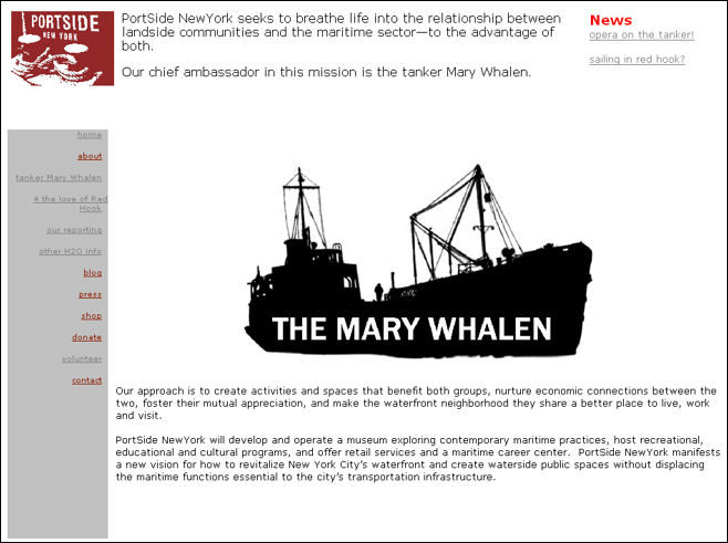
What works:
The visual design is very elegant:
- A simple five-color palette--maroon for the logo, black for the ship and text, gray for the navigation bar, red for "News," and a white background. The red-gray-black-white combination always works really well, but few designers dare to be that disciplined.
- Simple design--essentially, three rectangles make up the entire page. First is the header, with the logo, the mission statement, and the News block (this changes to the logo and a small Mary Whalen silhouette on subsequent pages). Second is the gray block of the navigation bar. Third is the body space between the two rectangles holding text and the dramatic silhouette of the ship.
On the Tug Pegasus site, we used 1-pixel-wide lines to separate the top banner and the navigation panels from the body space. There was some discussion, after we saw the Portside New York model, about using a gray block for the navigation panel. However, since that would have been a case of belt and suspenders (or a complete redesign late in the game), we rejected it in the end.
What doesn't work:
- The secondary pages are full of interesting information and links, but the depth of information on the site is not even hinted at on the home page.
- The Red Hook connection, except for the menu option, "4 the love of Red Hook," doesn't appear on the home page. This is unfortunate, since the impetus for the site and project seems to be the community-based revitalization of Red Hook, Brooklyn. It's not about the Mary Whalen alone.
Battleship TEXAS
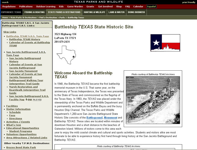
What works:
- The "Skip Links" link at the top of the left navigation menu indicates that this site has been optimized for screen-readers, which are usually used by people who are blind or partially sighted. Accessibility is very important, especially for government sites and organizations that have government contracts. For more on accessibility requirements, see Section 508.
- There is a link to Spanish material. However, the top-level menu names don't change and the amount of Spanish text is limited.
- The overall look matches the federal and state parks departments' templates. It's clear, the colors are attractive and contrast well, and the format is easy to understand and follow.
- The left navigation area offers many links to the Battleship Texas and the San Jacinto Battleground. At the bottom, "Other Nearby T.P.W.D. Destinations" points tourists to other parks they might visit on the same day.
- Not shown here, but the "Battleship TEXAS History" page is well-written and comprehensive. Worth considering as a model for the Tug Pegasus history pages.
What doesn't work:
It's staid--good for a battleship but it won't help us with the Tug Pegasus.
Maine Maritime Museum
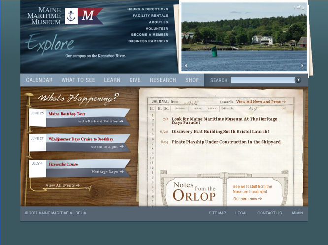
What works:
- The colors and textures--blue ocean waves and brown wood--work well for a maritime site.
- "Notes from the Orlop" is a real treasure, and at 17 pages, it's too short. Luckily, at the end there are links to more Orlop notes.
You may have heard that all text on websites should be short, that people don't read or don't like long text. This is untrue, provided that you meet two criteria: 1) the material is interesting to read; 2) it fulfills the viewer's need for information. For example, if you have pinkie-finger cancer, you'll read any amount of information about pinkie-finger cancer, bone cancer, and hand physiology that you can find.
- The headings on the left ("Explore") and the pictures on the right (the green buoy and the white boathouse) change, slowly--about once every 10 seconds.
Too many websites flip between pictures incessantly (see Signal Corps, for example), but all this does is distract the viewers. Our eyes are drawn to change; if a picture changes every two seconds, viewers just aren't going to notice anything else on the page. We've seen this time and again during usability tests.
If you want to include animation, either run through the pictures once and then stop, or replace them as slowly as the Maine Maritime Museum does.
What doesn't work:
- The home page layout is a bit dull. The secondary pages are more lively and contain much more information than you'd expect from the home page.
- There are two top-level menus (near the logo, "Hours & Directions," and below the logo, "Calendar") and another on the left ("What's Happening?"). Some of the information is repeated between the two top menus. Unnecessary repetition makes a site seem more complicated than it really is. Also pity the programmer--or office manager, more likely--who has to keep this site up to date.
Mariner's Museum
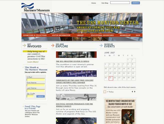
What works:
- This site has two top-level menus, but in this case, they make sense. There are the standard, static options--exhibitions, visitor information, library, etc.--and then three calls to action below that list--"Get Involved," "See and Explore," and "Museum Events."
- "Help bring one of our country's premier Civil War attractions to life! Learn more!" is an excellent way to pique a viewer's interest but still leave room on the page for other activities.
- The "e-update" sign-up area is an excellent idea. So is the option to email the page to a friend. This really takes advantage of the Internet's social networking capabilities. A USS Monitor blog is also available on the USS Monitor page.
- The clickable calendar under Museum Events is a great idea for an organization with many activities.
- The Membership page has two novel fundraisers: You can buy a paver to support the USS Monitor restoration and you can sponsor a page on the site.
- The site honors text-size changes (View > Text Size on the browser itself).
What doesn't work:
- The only odd thing about the site is that the top-level menu, which appears at the bottom of the graphic on the home page, shifts to the top of the graphic on secondary pages. Each of the secondary pages or sections uses a different color scheme (not bad, just surprising).
Mystic Seaport
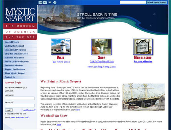
What works:
- At the very top, there are icon buttons to change the text size, send email, and print. The site has a print CSS (cascading style sheet) that ensures that the pages print well.
- The design is attractive and dynamic--not just the two slowly changing banner images and bubbles at the right side, but the wavy edge on the banner and the old-timey typeface in the logo.
- The site offers many educational programs. If you click "Educational Programs," the Education page appears and the menu opens up to show a variety of educational programs, from preschool to adult. Clicking on the menu option opens a third level of options. (However, the page to the right shows very little information and some viewers might not realize they have to click the options at the left to get complete information.)
What doesn't work:
- The four buttons at the top will probably be overlooked by most viewers.
- The three "call to action" pictures/buttons ("Visit," "Shop," and "Membership") take up too much room. They force the live information, in this case, "Wet Paint," nearly below the fold.
- A pop-up appears when you open the page. Usability tests show that people dislike pop-ups and close them almost immediately, even when the pop-up offers something they might actually want.
- The change-text-size buttons only resize the text in the box to the right. If you use the browser's text size options, all of the text changes size, which is the right way to go. However, the menu buttons in the left navigation don't change size. When you make the text really large, the menu labels get jumbled on top of themselves and are no longer readable.
|
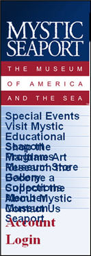
The buttons don't expand to match the text. |
Bluenose
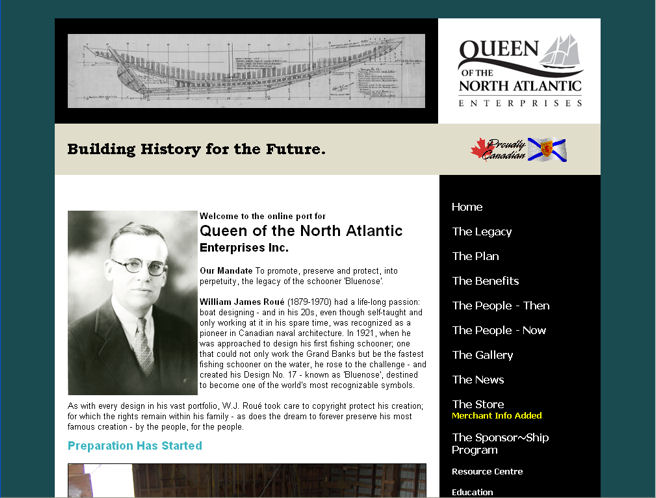
What works:
- The drawing at the top of the page is intriguing, although unidentified.
- The color scheme is attractive.
- The secondary pages are chockfull of good information, including sail plans, ways to donate money, the people involved in building the Bluenose originally and in reconstructing it now.
What doesn't work:
- Bluenose is mentioned, not featured, on the home page--the name is in the mandate and at the bottom of the William James Roue biography. People in the maritime field are more likely to search for the "Bluenose" page than for "Queen of the North Atlantic" or Roue.
- The most interesting information is below the fold.
- There are no ALT tags for the photos.
- There is no link from the drawing at the top of the home page to a larger version.
Rocking the Boat, Programs
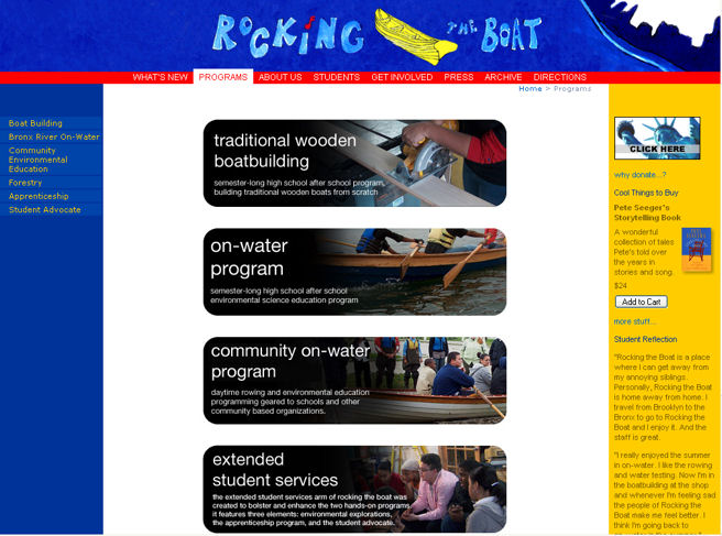
What works (on the Programs page):
- The color scheme and banner image are lively.
- The photos are attractive, and the ones on the tertiary pages are even more so.
- The page and the left navigation menu are clear about what's on offer.
- Offering various things for sale on the right is a good idea.
- Student recommendations ("Student Reflection") of the programs are a good idea as well--it makes the information more personal.
What doesn't work:
- The Student Reflection is hidden on the right side. It should be highlighted. Social networking and reviews could easily be a bigger part of this website.
- The regularity of the elements in the body of the page fight with the amateurish banner image (not that amateur is bad, but the image is too small and too rough for the rest of the page).
Take-away: Tug Pegasus could collect student comments and recommendations for the Programs page.
|
