|
You are here: Case Study, Tug Pegasus
Case Study: Tug Pegasus

Photo © Victor R. Stanwick
In 2007, FAST Consulting redesigned a small website for a non-profit organization, the Tug Pegasus Preservation Project. Pamela Hepburn, its executive director, is a licensed tugboat captain who bought the tug in 1987 to work in the harbor, and then turned it into an educational exhibit (but kept it in working order) in 1997. The website contains the complete history of the tug and the restoration. (For a biography of Pam, see New York Waters by Ben Gibberd.)
The idea of this case study is to give organizations with little experience buying web-design or user-experience services an idea of what to expect. We've included actual mockups and discussions as well as background information whenever possible.
Professionals may notice that the process seems a little loosey-goosey--there are lots of shortcuts and not very many iterations. However, keep in mind that Tug Pegasus is a non-profit organization with little money to spare for marketing (a friend once called a wooden boat "a hole in the water you throw $100 bills into," and a hundred-year-old tug is no better). And if you look closely, you'll see that most of what a usability engineer would do on a market-rate project is there.
Why Tug Pegasus?
Pam Hepburn and I have known each other for a long time, back to Ship Wavertree days, when we collaborated on an informational sign for South Street Seaport (actually, Pam did all the work and I just hung on for the ride). The sign showed tourists what the different configurations of tugboats, barges, and ships in New York Harbor meant.
For example, if a barge was low in the water, then it was loaded and was probably heading out to sea. If it was high in the water (light), then it was probably headed upriver to pick up a load. All these vessels were shown in silhouette and the design made it very easy to understand what was going on in front of you on the river. Unfortunately, the company that made the sign used bad ink and it faded away after a year or two.
Victor also worked as a deckhand on Tug Pegasus for a few local trips in the 1980s.
So in April 2007, when Pam called us to ask if we could help her update her website, we said, "Sure, we'd be delighted." And we were, because we've always been interested in Pam's old steam tug, Pegasus, and we're always happy to help Pam out. We just didn't have an opportunity till now. So Pam pointed us to the Tug Pegasus website and we took a look at it.
Starting Point: Existing Site as Prototype
Here is the original home page and a quick analysis of the good points and not-so-good ones. I mostly analyzed the "feel" aspects (navigation, accessibility, and so on) and Victor looked at the "look" (visuals).

What works:
- The top menu does a good job of saying what visitors will see on the site.
- The symbols over the top navigation buttons are interesting.
- The rivets are an interesting visual element.
- The bottom links are a good idea.
- Network for Good handles donations for a small fee, so Pam doesn't have to manage accepting credit cards and sending receipts herself.
What doesn't work:
- The text is very hard to read against the busy background.
- The centered text, ragged on both sides, is difficult to read.
- Photos are run together, and there are no captions or "alternate" text (popup text).
- Most of the pictures are too small to understand easily.
The secondary pages have many of the same virtues and problems. Here is one example, the Project page:

- The site is rich with information. However, much of it is hidden on secondary pages or even tertiary pages, like the ones linked to from this page.
- Some of the options seem to be repetitive. For example, there's a "History" page accessed from home, but "History of the Project" and "Early Restoration" seem to be historical information as well.
- The rivet background doesn't interfere as much on this page because of the gray background. However, the gray in the background doesn't match any of the grays in the rivet background.
- The left-hand navigation is the same on the secondary pages. However, these options were along the top on the home page.

Who Does What?
After Victor and I reviewed the site together, we decided we could do something to help pretty quickly. We went back to Pam and asked her for two things: her goals for the site and favorite sites other than her own.
Goals
These were Pam's goals:
- More on the restoration itself
- Make it easier to update the press page
- Separate the history of the boat from the history of the restoration better
- Promote the programs (activities, educational programs, events)
- Update the home page
Although these goals may seem vague, any designer (graphic designer, web designer, architect, etc.) would recognize that they're a good start. Goals don't jell right away, and the combination of a designer's expertise and client feedback over time will usually lead to good solution. (In the computing industry, development using feedback cycles has been codified as "agile programming" or "extreme programming.")
In fact, strong opinions and fixed requirements too early in the process can be damaging: Providing solutions before figuring out what the problems are prevent the design team from finding the best answers. Loose expectations and goals, on the other hand, let the team members play around and find more creative solutions. For a demonstration of this in industrial design, see the ABC News documentary, The Deep Dive, about IDEO's redesign of a shopping cart. (To buy a copy of the show, go to the ABC News store.)
Favorite Sites
Competitive research is always good. Pam had a list of favorite sites, and we looked at sites that had similar goals or a maritime flavor.
Note that Christopher Fahey of Behavior Design suggests asking clients what their least favorite sites are, too. This helps you cut the universe of possibilities in half immediately as well as help you get to know your client's tastes better.
Here is Pam's email about her favorite sites (see our analyses by clicking the italic links):
Just for the fun of it--some other historic boat links:
There's a lot I like about the sites but I actually like ours better--except the home page.
The maritime museum and boat sites that Victor and I looked at were:
A later addition to the list: Portside New York > FAST's analysis
What the analyses showed us was that:
- Thumbnail photos of people in close-up, with not too much background clutter, draw you into the site.
- Lots of links and logos to other related organizations (funders, organizations that use your venue, etc.) make the home page seem like a portal into another world. The home page becomes something like an Advent calendar card--you open all the little windows to see the scenes inside.
- To make a site seem lively and active, you need a bit of a mess. There has to be an underlying organization but the home page can't be too neat.
The Letter of Agreement
Even with friends, it's best to write a contract or letter of agreement, not just for legal reasons but because a document spells out the responsibilities for both parties. As Gerry Weinberg says in The Secrets of Consulting, "The money is usually the smallest part of the price."
You can read a copy of the letter (prices removed). Note the following:
- The scope of work lays out what the client is responsible for, not just what the contractor will do.
- The letter describes not only the job itself but also the process of doing the job. This helps set expectations. Clients sometimes think they're going to to see a final version at the first meeting, and the letter of agreement can warn them that the early drafts will be messy. All of FAST's letters state that there will be first drafts from which the clients gets to select the version, or the bits of each, that she likes best.
- We always include a cancellation clause that lets either party cancel at any time. We had a client once that wouldn't let us end a job even though it was over their budget and long past their deadline. We were still billing them and they were still paying the bills, but we couldn't stand doing the job anymore. (We eventually got out of it by passing it along to someone else.)
Teachers: Click here for a college-level lesson plan on writing letters of agreement.
Fixing the Look: The Mockups
Once we had a signed letter of agreement, Victor created a set of mockups. We delivered all of the designs at the same time so that Pam could pick and choose what she liked from all of them.
Alternate #1: Wrenches and rivets
Here is the first alternate design:.

Photo © Jonathan Atkin
The rivets from the original page are reduced to a single row at the top, and the various pieces of art are reduced to one, a wrench.
Pam's reaction:
TUG PEGASUS PRESERVATION PROJECT: Pegasus should not be italicized in the name of the org--just when you refer to the boat--altho some of our text might be that way...
I think the text on the banner of the sight should be kind of old
timey--not over the top gothic--but with serifs--19th century industrial. Samples below.
I love the wrenches.
Can the home page have a banner across the top with the wrench page type links and hot link images on the side--maybe just the left side--like an image of the original drawings ... that would then link you also to these areas of the site.
--Pam
The typefaces that Pam suggested were Didot and Oldstyle. Good suggestions, but there is a problem, as I wrote back:
Those are nice typefaces and anything is possible.
The problem, though, isn't just the expense of getting a license to use a typeface. If you try to set a typeface (like you do in Word), if a viewer doesn't have that font on his or her system, the browser will substitute a default font, which may not be what you want at all.
So to show the new typeface, you have to create a picture out of the text. When you create a picture, though, you have two problems--downloading the picture before viewers can even see the banner; and making the text in the banner accessible to people who use screen readers--the picture has to have ALT[ernative] text attached (no big deal, but many web developers forget to do it).
Also, as soon as you create a picture banner, the site starts to get fat and slow. I suggest trying the lean and fast style to start, and when lean REALLY doesn't work for something REALLY important, then we look into fat.
But Victor is very good at this kind of stuff, plus your sketches are very helpful, and between the two of you, I think you'll get something that works for you.
--Susan
Alternate #2: Stacks
Here is the second alternate design. This one uses links in a chain for the buttons. Pam didn't like the chain links--not realistic enough--but she liked the smokestacks, picked up from the original version of the history page. (Us, too).

Alternate #2: Photos of stacks, plus a chain-link menu.
Alternate #3: Lots of Photos
The third mockup is based on a standard Dreamweaver template. The nice idea here is to use pictures to lead people into more information about the various programs. Having lots of pictures also seems to indicate that there are lots of programs.

Alternate #3: Having lots of photos implies that you have lots of activities.
Alternates #4 to #6
The last few mockups are also based on a Dreamweaver template. Victor experimented with different illustrations and photos for the banner.
Note that we don't actually think red text on a blue background is a good idea. The grayscales of the two colors are too close to be able to pick the text out from the background easily, and red on blue creates flicker.
Alternate 4 shows the main navigation on the left and the content in the middle (with a note that "this needs work").

Alternate #4: Navigation on the left.
In alternate 5, Victor suggests moving the "Photos" material to the "History" page, since most of the photos are about the history of the tug. Photos are lined up on the right rather than horizontally, as in mockup 3.

Alternate #5: Photos on the right.
In alternate 6, for the "Store," Victor used a moody photo in the banner, and constructed a fictional storefront. Pam has a CafePress storefront, though, so this page either has to link to CafePress or, if Pam doesn't have anything to sell directly, be replaced by the CafePress page.

Alternate #6: A moody photo in the banner, a mock storefront in the middle.
Negotiating the Next Version of the Look
After she looked at the first prototypes, Pam sent us an interesting banner constructed from rivets (or bolts) and a row of silhouettes to use as buttons:

Pam's mockup with rivets at the top and tugboat menu buttons.
Unfortunately, the rivets look pushed in instead of out (and therefore may not be rivets) and the tugboats are facing the wrong way, as if they are chugging out of the frame. We're also concerned that they aren't going to be big enough to hold some of the menu labels.
So on Saturday, June 23, we went to the Morris Canal to meet Pam and take photos, hoping to find some images that we could use to create the banner and perhaps the buttons.
 |
| Tug Pegasus in context: Next to a working barge with pleasure boats behind her. Photo © by John Watson. |
 |
| Where the tug was on June 23, 2007 (Google Maps). |
Here are some of the photos that Victor took of textures to use as a background for the banner:
 |
 |
 |
| Bolts as a possible texture |
Chain as a possible texture |
Rope as a possible texture |
 |
 |
 |
| Floorboards as a possible texture |
Rivets as a possible texture |
More rivets |
In our conversations that Saturday about the existing mockups, one word kept coming up: "Gritty." Pam wanted the tug site to look gritty, not polished--the tug is a working boat, not a pleasure craft.
Version 2 of the New Look
With "gritty" as our keyword, Victor picked out and blew up a section of one of the riveted panels to create a banner ("the Tug PEGASUS Preservation Project" area below).

The "gritty" banner. Photo © Jonathan Atkin
We made a few other changes as well.
- A left-hand navigation panel was added to show high-level options. These options are all visuals, matching the liveliness we liked on the Steam Tugboat and Waterfront Museum pages.
- We broke up the text, using a line from the body copy, "We are packaging education in an artifact," as a new heading and breaking up the original two paragraphs into multiple paragraphs and bullets.
- We added a row of rivets at the bottom to see if it provided a clear ending for the page. (Or maybe just because we liked how they looked.)
I sent the new mockup to Pam with this message:
Hi Pam:
Victor redid the home page with a rivet header (from a photo from Saturday) and a different typeface. You can see it at http://www.tugpegasus.org/vindex2.htm. The menu buttons at the top don't go anywhere yet.
The goals here are 1) to make sure the site looks gritty, not slick; 2) use a better typeface for the banner; 3) show photos that pop out and point people to more information (#3 is the same as what you saw on Saturday). The text under the photo of the tug is the same text as is on your current home, rearranged a bit to make it more interesting visually.
To come: Sample history, programs, etc., pages so that we can show you versions of the left navigation bar.
Your task is to look at the new version and tell us what you like and don't like about it. Also, for the left navigation, what do you want as the top two buttons/photos--programs and volunteering, or programs and history, or X and Y?
Best regards,
Susan
Pam's Response to Version 2
Hi
I had to think about the Home page--here's my response:
The rivets look like they belong to something living and they look creepy to me.
The page is OK but it looks a little dry(?)--maybe a window of one of the drawings and a not-white background??? If we are having the rivet rectangle banner on all the other pages we should maybe do something different here--different buttons and different banner??
The concept of course is brilliant.... Talk to you soon. Thanks.
P
Oops, that wasn't what we'd hoped for: a too-dramatic texture. Do the rivets look like a skin disease? (Note that some metallurgists think that rust has a biological component, so perhaps we are looking at a skin disease.)
So, back to the drawing board.
Version 3 of the New Look
I was uncomfortable with the neat (non)rivets in Pam's banner, but since I am neither the user nor the client, I thought I'd test a few different banners with the team, plus another friend of ours and Pam's, John Watson (yes, this is a too-small, too-interested sample). Here is the first email I sent:
Hi Pam, John:
Victor and I would like your votes on the banners and typefaces in the table below. Fill in your numbers and send it back.
Please keep in mind that these are just sketches and we have other typefaces and photos we can work with. We're just hoping your choices will point us in the right direction.
Thanks,
Sue & Vic
Tug Pegasus banner possibilities
Please number these in terms of image appeal on the left,
typeface appeal on the right. “1” is best.
| Image Rank |
Banner Image |
Typeface Rank |
| |
A.  |
|
| |
B.  |
|
| |
C.  |
|
| |
D.  |
|
| |
E.  |
|
| |
F.  |
|
| |
G.  |
|
| |
H.  |
|
Results:
- John Watson: Favorite image, C; second, A. Favorite typeface, A; second, D.
- Pam: Favorite image, A. Favorite typeface, A. (In a phone conversation, she said she liked the gritty hand-lettered look of the first typeface and that she also liked the image in E, but perhaps as the home-page image rather than as the banner).
- Victor (although I didn't ask him): Favorite image, A; two second places, D and H. Favorite typeface, A.
So Pam's banner wins (and my reservations lose). The next step was picking a typeface from among the ones Victor and I have on our systems (Pam couldn't find the one she used for the mockup). I was hoping that everyone would like #4, Georgia, since Georgia is one of the typefaces available on all computers. If Georgia was okay, then the banner image wouldn't have to contain the text and would require fewer bytes. My next favorite was #5, a typeface called "Michael."
We seem to be comfortable with the rivet banner, so now I'd like to see which typeface you prefer. Pick a number, any number, from the list below. Pam, what's the name of the font you used in your mockup?
--Susan
| Typeface |
1. Oldstyle 1:

|
2. Requieum:

|
3. Blackadder:

|
4. Georgia:

|
5. Michael:

|
Results:
Pam: Oldstyle 1 YES; Requiem NO; Blackadder NO of any kind.
John: Oldstyle.
Victor: Whatever works for everyone.
Overruled again! Oldstyle it is.
Note that this test would have been more fair if I'd randomized the order for each person who took the test. Randomizing the order prevents positional bias (people sometimes just pick the first item or the last item on the list, so you can minimize this effect by randomly changing the order of the items). On the other hand, the background my three subjects selected is clean and Oldstyle is both easy to read and old-fashioned enough to go well with an old tug.
Fixing the Feel: What Goes on Which Page
The next set of challenges were straightening out the navigation and ensuring that the site was accessible. These aspects aren't as visible as the graphic design, but if done right, they would lead to greater satisfaction with the site--even if the readers didn't know why they liked it so much.
Navigation
Navigation has two aspects--the menus that appear on the page at the top, bottom, left, and/or right side of the page; and shortcut access to all the site content. The menus should make it easy for visitors to know what they can find on a site and to browse through it. The shortcuts, which let visitors go directly to the desired information, are usually things like search or site maps.
What Goes on the Menus
One of the first things we did was create a Visio graphical map of the original site. Although the names of the pages are too small to read, you can see that the old site is fairly complex. Also, it looks like some of the pages are disconnected from home.

The old site, with the home page towards the middle.
Later, we created a Visio map for the revised site. The number of pages and links are about the same, but the number of connections seems lower and the navigation is more straightforward.

The new site. The home page is in the middle.
How did we get from the original site's menus to the new site's? First, I printed out every page and listed every page name and link I found on a yellow pad, and then organized them by topic. For example, all pages that described the tug's history went into the history section, and all pages about the organization went into About Us.
For a more formal project, I probably would have sketched out a new menu structure or done a wireframe in Visio. In fact, a wireframe would have been useful. Pam was puzzled by the menus for a long time, not realizing that home would have a left navigation menu as well as top navigation and that the secondary pages would all have top navigation as well as left navigation menus.
But note that the top-level menus for both the old and new versions are similar (although "The Project" has been subsumed under "History," the "Photos" page went away since all the photos show up on the history pages, and "Thank Yous" and "Contact Us" are now part of "About Us").

Old menu bar.

New menu bar.
The key similarity is the "story": Readers go from the home page to the tug's history. If they're still interested, then they read how they can become involved with the tug (programs), then how they might support the tug, and finally, who the people behind the project are. Too many sites start from the opposite direction: Who the CEO is and how lovely the corporate headquarters are, only gradually moving to why the organization exists and what their activities are.
No Search?
Early in the process, we put a search box on all the pages, but Pam didn't like it--it took up too much space, she said. Search is a last resort, however. People turn to search when they can't find what they want by browsing and if the menus are clear enough, search is sometimes expendable.
But doing without search means that we need to test the organization of the menus and some of the pages with real users. For example, it's possible that people will not think to look under About Us for press releases and volunteering opportunities. If they have trouble, we'll revisit the search option.
Making the Site Accessible to Everyone Who's Interested
Section 504 and 508 of the U.S. Rehabilitation Act and the broader Americans with Disabilities Act (ADA) say that people with disabilities must to have equal access to the life of the nation. Section 508, in particular, requires all federal agencies to make sure that all electronic and information technology that they use or offer, such as websites, must be accessible to anyone likely to use the technology. A non-federal entity such as a university or a city, county, or state government that receives federal monies also needs to comply with Section 508 requirements.
Although the Tug Pegasus project hadn't yet received a federal grant, it has received state and local government grants. If the rules don't apply yet, they probably will sooner or later. Better to be prepared.
ALT Tags Aren't All They Ought to Be
ALT tags are one of the primary accessibility tools--screenreaders read them to people with vision problems and they show up when people with slow connections turn pictures off on their browsers. (They also show up if you hold your pointer over the pictures for a second or two.) However, ALT tags turned out to hold some surprises.
Since I use Firefox as my main browser and Victor uses Internet Explorer (IE), we often test the differences between browsers inadvertently. Dreamweaver insists that we add ALT tags to all our photos, so we do. This works fine for IE, but I began to notice that I wasn't seeing "hover help" when I held the cursor over pictures on Firefox. Hmm.
 |
 |
| ALT tags work on IE... |
...but not on Firefox |
The reason is that Firefox uses the "title" instead of the "alt" property to hold descriptions because "title" is more in line with W3C (Worldwide Web Consortium) rules. (For more on ALT vs. TITLE, see W3 Schools' information about the img tag.) However, if a user has images turned off, Firefox uses ALT, not TITLE, to provide a placeholder description of the picture.
Solution: Put TITLEs and ALTs on each image. For example, for the above left photo, the image properties should be <img src="images/ALT_IE.jpg" alt="ALT tags work on IE..." title="ALT tags work on IE...">.
 |
| Firefox with images turned off. The ALT text shows up instead. |
 |
| Internet Explorer with images turned off and the ALT text displayed. |
 |
 |
| Testing: To turn off images in Firefox, click off "Load images automatically." |
Testing: To turn off images in Internet Explorer, click off "Show pictures." |
Unfortunately, I didn't realize we needed both until the site was nearly done. There is nothing more time-consuming and mind-numbing than adding extra ALTs or TITLEs to an entire site. (This, it turns out, is why iPods were invented.)
Make Video and Flash Accessible
The Tug Pegasus website has no Flash or video clips (yet), but if your site does, consider using closed captioning and Descriptive Video Service (DVS), a system that adds audible descriptions of scenes to videos and movies for blind viewers.
The Media Access Group at WGBH in Boston has always been in the forefront of accessible video and TV. They developed closed captioning and now DVS for TV, movie houses, and online video. You can try the system yourself if your TV has "Second Audio Program," often abbreviated as SAP (look for a button labeled SAP on your remote control). Try it on the Simpsons.
For more information and tools, see:
Letting People with Screenreaders Skip to the Content
An important and simple accessibility technique is to provide a link at or near the top of each page that lets people using screenreaders skip all the menus and jump straight to the page content.
When usability and accessibility experts Mary Theofanos and Ginny Redish studied people who use screenreaders, they heard that many users "desperately wanted to not listen to the navigation each time they got to a page. They wanted to get right to the content." However, many didn't do so, sometimes because they didn't know their screenreader could do it for them and sometimes because they couldn't understand the "skip" command when they heard it.
Theofanos and Redish found three common "skip" options: "skip navigation," "skip to content," and "skip to main content." Only "skip to main content" works:
- "Skip navigation" is web jargon and many people, sighted or not, don't know what that means.
- "Skip to content" comes out as "skip to conTENT" because of the way JAWS and other screenreaders pronounce the word, parsing it as an adjective rather than a noun.
- "Skip to main content," however, works--the screenreaders parse "content" as a noun because of the adjective in front of it.
So we use "Skip to the main content" on the Tug Pegasus pages.
Finding the right place to put the link was a problem, however. In an early version of the pages, we put it at the top, above the logo, in normal type. But Pam said, "I would also like to lose the "skip to the main content" little word thing--it's distracting--do you really need it?"
Well, yes, but it doesn't have to be as obvious. Making it invisible, however, could be a problem with the search engines, which don't like to find invisible text on a page, and with various screenreaders, which might not read aloud text marked as "display: none" or "visibility: hidden" (defeating the purpose of having the link).
What we did is put the link just above the banner in small yellow type. Most sighted people won't notice it, but the screenreader we use to check websites, ZoomText, picks it up fine.
A few resources:
To test your own sites for screenreader compatibility, try these demos:
- JAWS from Freedom Scientific. The market leader.
- Window-Eyes from GW Micro. A well-respected product.
- ZoomText has both a screenreader and a magnifier and is relatively cheap.
Note that JAWS and Window-Eyes are expensive and feature-rich, but they also have longer learning curves. Although ZoomText is probably not what you'd get a blind friend for Christmas, it's very simple and great for testing websites. Warning: There is a screenreader built into Windows XP. However, it permanently changes your regular display (I've had to use System Restore to get rid of the bad settings) and doesn't do a very good job of reading the screen either.
Tables vs. CSS Divs
Some accessibility experts and books (Web Accessibility for People with Disabilities, Access by Design) warn against using tables to manage page layout (primarily for columns), since tables as a rule do not behave well with screenreaders. In fact, I myself have told clients not to use tables for layouts. To make tables understandable to people using screenreaders, say the gurus, one needs to fill in all the column and row properties, titles, etc.
However, when I started this part of the project, Victor pointed me to Building Accessible Web Sites by Joe Clark. In his chapter, "Tables and Frames," which you can find online, he differentiates between tables used for layout and tables used for data. As long as you keep layout tables as simple as possible, he says, using only <table>, <td>, and <tr> tags, then screenreaders and the text browser Lynx will have no problem with them. I've tested the Tug Pegasus pages with ZoomText and the pages are read correctly.
However, you can certainly use DIVs to separate columns. In fact, my touchstone accessible site, the Aberdeenshire Council, uses DIVs very effectively to create columns.
Honoring Type-Size Changes
One of the surprises in trying to make the pages accessible was that Firefox bumped up the text size, no questions asked, whenever I pressed Ctrl and + (or used the View menu text-size options). However, Internet Explorer did nothing with the same request. What the heck?
 |
| Firefox changes the text size, in this case to one step larger. |
 |
| Internet Explorer, however, does not change the text size. |
So I looked in a couple of my accessibility books, and got only a clue from one of them--use relative sizes, not pixel sizes. I changed the font definitions from pixels (for example, 13px) to small, medium, large, and so on, and now resizing works on IE.
After changing the Tug Pegasus CSS, I rechecked Simon Collison's Beginning CSS Web Development; he says that text will also be resizeable if you use ems to size the type.
Note: Some sites have a "change text size" widget that looks like three A's in a row. Sometimes the designer creates three different CSS files for small, medium, and large type, and clicking one of the A's loads the desired CSS. Sometimes he or she writes a small program that does the same thing (for a tutorial, see A List Apart). Either way, you can then use point sizes instead of relative (percentage) sizes for your typefaces. The only problem is that a reader who wants REALLY BIG TYPE is out of luck if the largest typeface isn't that big.
Creating a Favicon
Just for fun, we created a favicon (FAVorite ICON) for Tug Pegasus. Alan Seiden pointed us to a free software gadget that generates a favicon, so we flipped Pam's tugboat button and ran it through the gadget. La voila, a tiny tugboat steaming toward the URL!

Search Engine Optimization
The Tug Pegasus website gets a reasonable amount of traffic, considering that it is geographically and topically constrained (New York harbor, boats) but, still, it would be good to make it as obvious as possible to the major search engines.
In general, to optimize a site for search, you need to do the following:
- Put key search words in the HTML header.
- Make sure the key search words also appear in your content.
- Make sure each page title is as specific as possible, since this is what shows up in the search listings.
- Avoid using all Flash (not a problem in the Tug Pegasus case since it has no Flash).
- Tag pictures, videos, and music files with metadata (the ALT and TITLE tags take care of this for pictures, and there are no video or music files so far).
- Ask customers what words they use and check your logfiles.
- Add a sitemap (done).
- Submit your URLs to the search engines.
What we did to optimize search for Tug Pegasus is described in the next eight sections.
1. Keywords in the HTML Header
Here is the keyword statement for the home page:
<meta name="keywords" content="Tug Pegasus,National Register of Historic Places,historic tug,historic vessel, historic ship,New York Harbor">
"Meta" statements contain information about the whole page, such as the character encoding (described next) and keywords. The search-engine "spiders" crawl the web looking for new pages to index, and one of the areas they check is the meta keywords statements. These keywords do not show up on the page--they're in the hidden header--but the spiders can find them.
For more information, see How to Use HTML Meta Tags.
Side Note: Being Accessible across Natural Languages
Note that there are two meta statements in the file (which confused me the first time I went rooting around in the HTML code). This is the other statement:
<meta http-equiv="Content-Type" content="text/html; charset=UTF-8">
The interesting thing here is "charset=UTF-8." This means that all text should use the Unicode collection of characters, which has letters and numbers for every character in nearly every language on earth. See What is Unicode? for more information. (You can see all the Unicode characters by opening "Insert Symbol" in your word processor, going to a Unicode font like Lucida Sans Unicode, and then scrolling through the typeface.)
In practical terms, if you set your page to UTF-8 and it is translated into Macedonian, you see this:
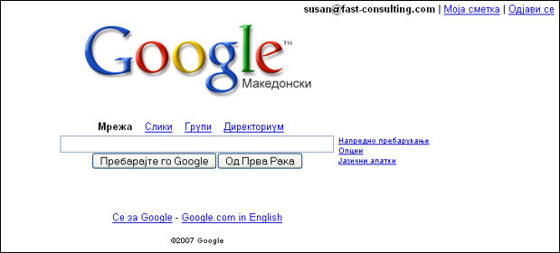
Google in Macedonian, using the Macedonian characters in the Unicode list
If you use a "local" character set like ISO-8859-1 (English), you get this instead:
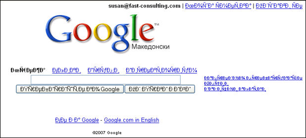
Google in Macedonian, using only the English character set
2. Make Sure Keywords Show Up in the Content
A few years ago, misguided or unscrupulous search-engine optimization companies would overload meta keywords with unrelated but popular words (for example, "porn, porn stars," etc.) to move a site to the top of the search lists. This is called keyword stuffing.
The search engines got wise to these tricks pretty quickly and will now blackball any site using keyword stuffing. To avoid being knocked out of search-engine indexes, make sure that any word in your keyword list also appears on the visible page.
In addition, spiders look for links to other sites (within reason--you can overdo this as well), so on Tug Pegasus, we made sure to include as many links to other sites as we could. For example, the original home page mentioned the North River Historic Ship Society and the Historic Naval Ships Association. We checked whether they had websites and when we found they did, we linked to them on the new home page.
3. Give Each Page a Title
The titles we're talking about here are the ones that appear in the blue bar at the top of the browser:

Home title bar
Search engines weight page titles highly, so you want to be as descriptive and specific as possible. For example, the new Tug Pegasus home-page title bar says, "Welcome to the Tug Pegasus Preservation Project."
Secondary pages show additional information:

Contact Us title bar

Early History title bar
The content of the title bar also appears on the search engine's results page. If the title matches the searcher's idea of what she's looking for, she'll click on your listing.
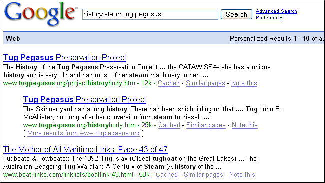
The page title appears in the results list.
4. Avoid Using All Flash
The Tug Pegasus site has no Flash animations and just one tiny GIF animation on the Contact Us page. If you, however, want to put animations and videos on your site, remember that spiders can't index all-Flash pages. If the first page on a site is all Flash, the spiders will stop and go no deeper.
Nevertheless, the spiders will index your site if you:
- Make the Flash page title as descriptive and as complete as possible (instead of "History," for example, use "Tug Pegasus Early History").
- Include text links at the bottom of the page; the spiders can read text.
- Put information about the page in the meta tags (for example, <meta name="keywords" content="Tug Pegasus,contact information">).
Macromedia offers help making Flash pages searchable. See "Flash and Search Engines."
Note that you will also have to take care to make Flash pages accessible. For more information, see "Flash 8 Accessibility."
5. Tag Pictures, Videos, and Music Files with Metadata
For image searching, make sure that your ALT and TITLE tags are both descriptive and distinct. The search engines can't interpret the meaning of images per se, so they depend on the labels associated with the pictures. These labels include captions, ALTs and TITLEs, and the metadata that can be included in SVG (scalable vector graphic) pictures.
(August 2007: You may notice that a few labels on Tug Pegasus are neither descriptive nor distinct. We are awaiting details and will correct the omissions as soon as we can.)
6. Checking the Logfiles: What Were People Searching for When They Hit Tug Pegasus?
We asked Pam for access to her Internet service provider's statistics pages. When we got there, we found a few surprises, as we told Pam:
There's some cool stuff in here, if you poke around...look at "Total Referrers" (scroll way down; this tells you where people linked from) and "Total Search Strings," which tells you what words people used to search for you.
Also see the "Usage by Country" information. Who knew you had fans in Croatia and Norway?
--Susan
Pam answered:
Too much info--me head is spinnin'.
Here is an example of the words people used to find the site in July of 2006:
| Top 20 of 81 Total Search Strings |
|
| # |
Hits |
Search String |
|
| 1 |
8 |
7.55% |
tug pegasus |
| 2 |
7 |
6.60% |
tugboat pegasus |
| 3 |
3 |
2.83% |
pegasus project |
| 4 |
3 |
2.83% |
steamer lilac |
| 5 |
2 |
1.89% |
TOTTENVILLE SHIPYARD |
| 6 |
2 |
1.89% |
fireboats |
| 7 |
2 |
1.89% |
manhatten project |
| 8 |
2 |
1.89% |
pegasus tug |
| 9 |
2 |
1.89% |
tug boats |
| 10 |
2 |
1.89% |
tugboat |
| 11 |
2 |
1.89% |
tugboat museum |
| 12 |
2 |
1.89% |
uss enterprise launch |
| 13 |
1 |
0.94% |
%22Helena Andreyko%22 |
| 14 |
1 |
0.94% |
%22morris canal%22 |
| 15 |
1 |
0.94% |
Boston Tow and Transportation |
| 16 |
1 |
0.94% |
Doug DellaPorta |
| 17 |
1 |
0.94% |
Hay-De tug |
| 18 |
1 |
0.94% |
Helena Andreyko |
| 19 |
1 |
0.94% |
KOSNAC FLOATING DERRICK |
| 20 |
1 |
0.94% |
Lilac lightship tender |
|
Once you've looked through a few months' worth of search words and found the most common ones, then use the nifty Google keyword tool to find synonyms and keywords you might not have thought of.
Here's an example of a synonym search on tugboat:
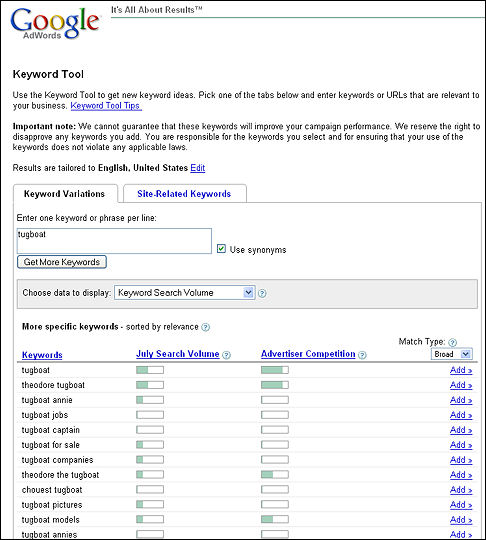
Here's an example of a keyword search on the URL tugpegasus.org:
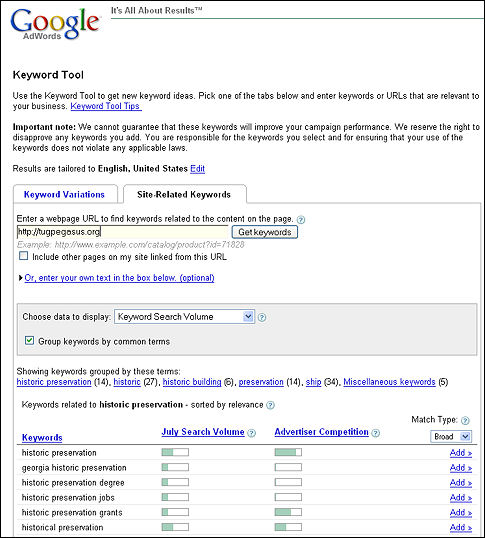
These results indicate that Google picked up "historic preservation" rather than "tugboats" or "boats" as the site's main theme. from the site. In the groups, you can see that there were 61 "historic" or "preservation" words but only 34 ship words. Maybe we should play up the historic preservation aspects, since that may be how people will find the site.
7. Add a sitemap
We put a site map in the new version, mostly for search engine optimization, but we were happy to find that Pam liked it too. "The navigation is brilliant!" she exclaimed more than once. "I'd never have thought of a site map."
You can do simple static sites like Tug Pegasus's site map by hand, as we did. However, if you have a site with pages that change on their own because they're drawing information from other sources, you will probably want a site map that regenerates automatically.
Here is a list of programs that will regenerate site maps automatically:
8. Submit your URLs
Once your site is up, it's time to test your SEO strategies by sending announcements to the main search engines.
When we submitted StatenIslandCSA.org to Google and Yahoo, it took about three weeks for the site to show up. However, note that if a site is visit-worthy, the search engines will eventually pick it up whether or not you do anything to call their attentions to it.
The Final Site
The banner ended up looking very different from the trials above. Pam took one final look at what we'd done and said, "I think it has to be simpler!"
So the banner is not a graphic at all, just text. And the final design is, believe it or not, all black and white (except for the menu items when you hold the pointer over them). Go to Tug Pegasus Preservation Project and check it out.
Sure, there's color, but it's all in the gorgeous photos Pam's friends--Will Van Dorp, Steve Wilson, Bernie Ente, Carter Craft, Jonathan Atkin, Gary Baum, Jeff Anzevinno, Pat Folan, Amy Buccifaro, John Stiles, Betsy Haggerty, Huntley Gill, Jay Holmes, Ray Montana, John Watson, Don Sutherland, and others--have taken for the site.
|
