|
You are here: Home ~ Websites ~ It's Pretty But I Can't Use It
"It's Pretty but I Can't Use It"
Why People Complain About Web Sites
Copyright 1999 by Susan Fowler, Victor Stanwick
Introduction
"It's pretty but I can't use it." Have
you heard someone say this about your site?
People also say things like, "This website
loads too slowly!" or "I get lost in this
site!" or "There's nothing here I'm interested
in!"
Web design is not like page design or even like
GUI design....
In this article, we will tell you things that you already know from
experience--you already know what the problems are.
But you may not know why they're problems
or you may not know what to do about them.
We intend to give you the information you need to
create usable pages and, if necessary, to defend
your choices in design and client meetings.

Standards
and Defaults
Colors
Color theory and much research have shown that red
is a very poor background color. There was a certain
web site that we were going to use as an example of
what not to do, but fortunately (or for the purposes
of this web site, unfortunately), they fixed the
problem since this page went into production. They
violated the following standard: they had a red background
with blue text. Look at the table below for an example
of what this does to your eyes.
Red
background, blue text...
Your
eyeballs are probably wiggling around
inside your head as you read this. Imagine
if you had to stare at this color combination
for an extended period of time? |
The reason the color combination above hurts is because
of the way the human eye focuses color wavelengths:
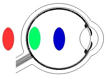
- Red wavelengths come into focus a little behind the
retina, so reds appear to pop out of the background
and come at you.
- Yellow and green wavelengths (as well as black and
white) come into focus at the retina and require the
least accommodation.
- Blue wave lengths come into focus a little in front
of the retina, so blue appears to fade into the background,
away from the eye.
For these reasons, blue makes a great background color.
You can use red if you want something to jump out at
the viewer. However, too much red text on a blue background
(or vice versa) will still cause your eyeballs to wiggle.
For foregrounds and text, yellow, green, black and white are best--they're as visible
on the periphery of your vision as in the center of
the visual field.
Color Confusion
One very important thing to consider when working
with color: Eight percent of males (that's every twelfth
male) are red-green color-blind.
The term "color-blind" is
a little misleading. Many men who are color-blind can
actually see the colors red and green when they are
used separately. However, when the two colors are next to each other, they have a tendency to "melt" together
and become indistinguishable. The key to avoiding this problem is using more than color to carry information. For example, on a chart, use a dashed line and a solid line; they can be red and green if you like, but the difference between them is reinforced by the style of line.
For one of the best articles anywhere on color confusion,
see Color
Vision, Color Deficiency by Diane Wilson.
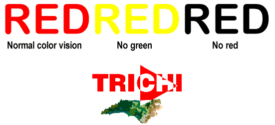
Wilson's TRICHI logo works even if you're
color-blind because
the colors have enough contrast
to stand out from one another.
Printing Colors
The web site for the First
International Software Assurance Certification
Conference, held in 1999 at the Marriott hotel in Dulles, Virginia,
had a greenish background with white text. The page contained important
information, and it is likely that many people printed it out. Or tried
to.
However, depending on the web browser they were using,
when they printed the page they may have ended up with only the
ISACC'99 logo and the title graphic at the top of the
page. Why is the rest of the printed page blank? Because
they asked their printers to print the text, and the text on the web page is white!
Both Netscape and Internet Explorer have print settings
window where you can set an option to print text in
black or print background colors and images. However, most users don't know about that window and wouldn't think to look for it.
Nicholas Zvegintzov alerted us to this particular
problem. And the color problem wasn't the only thing he found
wrong. Once Zvegintzov changed his print settings and
finally got the page to print, he discovered that the
top page had a WIDTH command in the HTML code, so it
wouldn't fit either on the screen or on the printed
page. Did the person who coded this page take lessons
on how not to be understood? By hardcoding the table
width to that of a high resolution monitor, the table
cannot be resized to fit the paper or the screen.
Suggestion: Offer your users a CSS for printing, a "printable" version of the page (just an HTML file reformatted for printing), or a PDF, especially if you feel you really need to create hard-coded
tables and especially if your web document spans more
than one web page (if a web article is on more than
one page, the reader has to print
each page separately).
Accessibility
Accessibility means access for everyone.
For instance, if you add alternate text (tool tips)
to the graphics on your web site, screen-reading applications
can read them aloud for blind or partially-sighted
users. What is alternate text? It's what you see if you place the cursor over
any of the graphics on this page (such as the "Top
of Page" pointer above). A small yellow box appears
with the description of the graphic in it (you have to write these for each graphic).
Making pages accessible also means accommodating
different web browsers. For example, FireFox doesn't
recognize ALT tags. If
you are designing and testing web pages using Microsoft's
Internet Explorer, also check them against FireFox, Safari, and Opera. Chances
are that some of these users will have difficulties with
your pages.
Navigation is Everything
Splash Screen Overload
Some web sites use "splash"
screens as their first pages. While some
of these splash screens are lovely to look at, such
as the Panama
Canal Web Site, they require significant amounts
of time to load.
Splash screens were invented for desktop applications.
Software programmers realized that they could stop people
from complaining about long load times by giving them
something interesting to look at. In other words, splash
screens were used to mask a loading-time problem. But
by putting a splash screen on a web page, web programmers create a loading-time problem. So don't do it--instead,
open your site with your real home page.
To Scroll or Not to Scroll
Newspapers originally coined the phrase
"below the fold" to indicate news items that
were important enough to appear on the front page, but
not important enough to show up at the top. These articles
appeared below the fold (where the paper was folded
in half).
Web sites work much the same way. The
information that appears at the top of the home page
is the information that people are going to read first.
However, Jared Spool found that people didn't mind scrolling
down a web page as long as they could tell that there
was something interesting below the fold. (His research
is described in Web Site Usability: A Designer's
Guide.) What he also found, though, was that
if readers didn't know there was something below the
bottom, they didn't scroll down.
Where Do the Navigation Buttons Go?
Jared Spool discovered that, even when a command button
was in the middle of a page and the reader was staring
right at it, she sometimes dropped down to the bottom of the page
and used the buttons there when she was ready to buy.
He didn't have an explanation, except to guess that the reader had been trained to do so by Windows dialog boxes, but the moral of the story is: Always repeat your buttons at
the bottom of the page.
Spool also found another reason to put navigational
aids at the bottom of pages--what he calls the "seducible
moment." Only after the reader has read the entire
article or review will she pay attention to advertising.
At this point, she's ready for more--ready to buy the
advertised product or book. See Seductive
Design for Web Sites for more information.
Raise the Data
to Ink Ratio
Restricted View
Looking at a web page versus a printed page is like
looking through a telescope versus looking with the naked eye. With a telescope,
you can only see one piece of the sky at a time—a small piece
of a much larger picture.
The resolution on most computer monitors is about
50 dpi (dots per inch). The best monitor resolution
is only about 72 dpi. However, the resolution of type
on a printed page is usually 1200 to 2400 dpi.
50 dpi, 100 dpi, 2400 dpi. Which one holds
more data?
For the level of detail you can get on an 8 1/2"
x 11" piece of paper, you need screen after screen
on the computer. What you can't see all at once, you
must see over time...
Raise the Ratio: Comparison Shopping
Jared Spool asked his usability test participants to
compare two things. He said they usually ended up printing
out pages, writing down notes, and using the Back and
Forward buttons on the browser. Only one person thought
to open two browser windows at the same time.
Companies with products that are able to fill more
than one need may want to make it easy for users to
compare those products. For example, Hewlett Packard
makes several different kinds of printers, many of which
are capable of performing more than one function. There's
a pretty big difference between functionality and pricing
among their line of printers. HP made it easy for their
customers to compare their products on most of their product web pages (for example, look at the business laptop comparison pages). Travelocity.com uses this same comparison technique
to help users buy airline tickets at the lowest possible
price.
Raise the Ratio: Wrapped Links
One of the biggest mistakes web designers make is creating
long columns of hypertext links that "wrap"
to a second (or even third) line. If there is no spacing or bullet points to separate the links, readers have no clear idea of where one link
ends and the next begins. It's pretty easy to fix this
problem, though--just look at Fidelity Investment's home page. The left navigation is a column
of hypertext links, but they're separated by bullet
points. It makes for a neat and easy to understand
site.
While we're on the subject of hypertext
links, let's look at the Disney web site. At Disney Travel, the links don't give you a clear idea
of where they'll take you. In the case of Disney, maybe this doesn't matter--DisneyWorld and DisneyLand are supposed to be magical places that you enjoy exploring.
But if you're trying to buy a car, you don't want to explore. In contrast, the hyperlinks at Edmunds.com tell you exactly what you will find when you click the
link. They are clearly labeled and easy to use.
Raise the Ratio: Internet vs. Intranet
vs. Extranet
On an Internet site, you must provide obvious navigational strategies like bright colors for important information and arrows or supersized buttons to indicate what readers should do next. Most
readers generally don't visit Internet site for long periods
of time--they find what they are looking for and move
on. Since they are in "uncharted" territory,
they will need more help up front than they would while
using a familiar application.
Intranet sites, on the other hand, can be more subdued. People will be using an intranet site
every day, and after a while they will notice every
little detail.
If you have an extranet site, such as the FedEx
tracking site where authorized users log on to
the system, consider mimicking the customer's branding instead
of displaying your own branding.
Elegant by
Design
Citibank's Original Americans with Disabilities
ATM Design
Note: The ATM design described in this 1990s article (adapted from ID magazine) no longer exists. Many banks have switched to talking ATMs instead, and online banking makes it easier for blind and partially-sighted users to do most of their banking using their own computers and screenreaders. So although the solution described below was a good solution, it wasn't the only solution. Adapt as needed. --Susan Fowler, 2008
Most American banks had no problem making their ATM
machines accessible to their vision-impaired customers.
In most cases, all the banks had to do was stick Braille
labels on the already existing machines. Many banks
didn't have to change any hardware at all.
Everyone in the industry was waiting to see what would
happen to Citibank, with their touch-screen ATMs. They
would either have to make some machines available with
standard buttons (and Braille labels), or remove all
of their existing ATMs and replace them with something
new. A great expense any way you look at it.
However, instead of replacing all of their ATMs with
some different model, Citibank asked its vision-impaired
customers what they would like to see.
With their customers, a team of Citibank programmers
in California and a usability engineer in New York,
plus designers at Two Twelve Associates in New York,
Citibank came up with a brilliant solution to the problem.
This solution not only made the ATMs accessible to the
largest possible number of users, but it was a much
better solution than simply pasting Braille labels on
button pads.
Here's what they did.
The problem...
Citibank's ATM machines use a touch-screen to perform
transactions (there are no physical buttons on the ATM).
A person with vision problems may not be able to read
the screen well enough to use the ATM. Citibank did
some research and found out that many (in fact
most) Americans with vision problems do not read Braille.
The totally blind may read Braille, but the majority of vision-impaired people
still have some vision. Therefore, the Braille
labels on most bank's ATM machines are not doing these
customers much good.
As you know from reading the information presented
in other sections of this web site, the best possible
contrast is black and white. The folks working on the
Citibank ATM problem knew this and used it to their
advantage.
The solution...
Citibank designed new interfaces for their touch-screen
ATMs. They designed interfaces with black backgrounds
and large white text buttons (a white background with
black text would have been too bright, their sources said--it was like trying to
read the label on a burning light bulb).
The basic look of the touch screens is completely different
from the "normal" screens that most users
see when they visit an ATM:
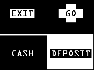
Citibank's ADA ATM touch-screen.
The vision-impaired user taps the words on the screen
to run through transactions. The ATM responds with tones
appropriate to the interaction--for example, one note for OK, a short falling tune for errors. (Citibank sends a pamphlet to its vision-impaired users explaining how to use the ATM and there is in-bank training as well.)
If the user taps CASH or DEPOSIT on the screen above,
a new screen appears on which the user can specify the
amount to deposit or withdraw (see the screenshot below).
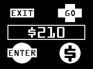
The deposit/withdraw touch-screen.
Tapping the large dollar sign in the lower right corner
increments each digit by one. "Enter" means "zero" in this context. For example, to withdraw
$210.00, you would tap the following sequence:
$ $ ENTER $ ENTER ENTER
GO
The ATM lets you know that it's processing the transaction
by showing you a clock and playing a ticking noise.
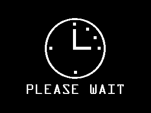
The transaction is being processed.
When the ATM is ready to dispense the cash, you hear
a three-part tone and the screen tells you to take the
cash (below).

The ATM has finished the transaction.
After you have completed all of your banking transactions
and signed off, the ATM thanks you by playing a 7-note
(major triad) tune (below). Vision-impaired users who were employed
to test the ATMs said at this point, "Oh, it's
saying 'Good-bye!'"
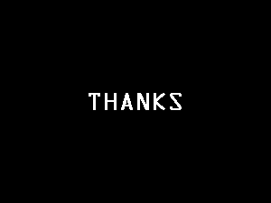
Citibank ATMs are nothing if not polite.
|
