|
You are here: Home ~ Desktop UIs ~ Checkbox - Cursor
Check
Box
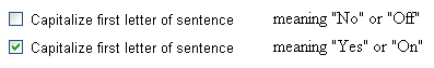
A button used to turn attributes or
states on and off. Users can set any number of check
boxes, including none.
Check boxes are square (radio buttons
are round) and can have either text or iconic (picture)
labels. The "on" setting is usually indicated by a check
mark or an X inside the box. However, Motif and iconic
check boxes (see Fig. 3) simply look pushed-in.
Good for:
Toggling a small number of independent
attributes or states on and off (Fig. 1).
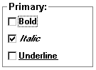
Fig. 1. A set of check boxes.
Toggling one setting on and off.
Use a single check box for a toggle (Fig. 2). See "Two-state
toggles" below.

Fig. 2. A check box used as a toggle.
Not good for:
- Transition changes such as starting
applications, opening dialog boxes, or navigating
to another screen. Use pushbuttons instead.
- Two-state toggles in which the two
states are not opposites. Use radio buttons instead.
See "Not opposites" below.
- Three-state toggles. Avoid this:
Use radio buttons or single-selection
list boxes instead. However, see "Mixed-value states"
below.
Design guidelines:
Although check boxes can be used on
menus (for example, to toggle settings on and off) and
in windows (for example, to toggle data points on and
off on graphs), they are most common in dialog boxes,
toolbars, and palettes simply because the reason that
these components exist is to hold settings.
Text labels appear on the side of the
button (in countries where the writing runs left to
right, on the right side).
Iconic labels appear on the check box
itself (Fig. 3). For more on iconic labels, see Iconic
Labels.
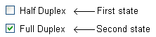
Two-state toggles
Every check box is a toggle—the setting
is either on or off. When you have a group of check
boxes, you have a group of independent and mutually inclusive toggles.
When you have a single-button toggle,
on the other hand, you are taking advantage of the fact
that a check box’s two states or settings are mutually exclusive—either yes or no, on or off—in a Boolean
sort of way. For example:
Problems occur, however, when either:
- The two states are not opposites.
- The check-button label contains negatives.
Not opposites

What is the opposite of full duplex?
To the uninitiated, probably empty duplex (or a single-floor
apartment, depending on the context). For modem connections,
however, the right answer is half duplex.
One solution is to change the label
depending on the setting, but that becomes confusing
for two reasons (Microsoft 1995a, 138):
- Changing labels makes the interface
seem inconsistent, which is a usability failure.
- Until the user clicks the button
a few times, he or she may not realize that clicking
sets the other state, not the state shown on
the label:
It’s confusing to describe, and worse
to specify and program. Here are some better ideas:
- Only when the setting’s two states
are opposites or can be easily inferred, use a single
check box. For example, "Allow fast save" or "Button
sounds enabled."
- When the two states are not opposites
or are not easily inferred, use two radio buttons.
For example, say that you have two types of color
fill—spot and flood. Spot and flood are not natural
opposites. To be clear, you’d use two radio buttons
(Leavens 1994, 237-240):

No negatives
The rule is, if the box is checked (true), then the
answer to the question (actual or implied) is yes. Otherwise,
the answer is no.
Therefore, to avoid double negatives
when the boxes are empty, always label the buttons with
positive statements. For example, "Disable sound card"
means, if unchecked, "Don’t disable sound card," which really means, "Do enable sound card." Eliminate
the negative dis- and use "Enable sound card."
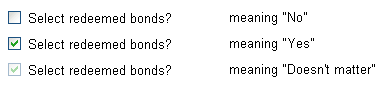
Mixed-value states
As mentioned in "Do Not Use For" above,
avoid three-state buttons (Yes, No, Doesn’t Matter,
for example). Since users have little or no experience
with three-state buttons, they either won’t notice the
different states or won’t know what to do with them
if they do notice the differences. Radio buttons or
list boxes are better choices.
However, the Microsoft guidelines allow
a mixed-value toggle when it reflects rather
than sets an actual user choice. For example,
say that you’ve selected an entire paragraph, some of
which is roman, some of which is italic, and
some of which is bold. If you then open a font
palette containing check boxes, the italic and bold
check boxes show a gray "mixed value" state, as in Fig.
4. If you click italic once, italic is turned on for
the entire selection, which is indicated by an X or
check mark in the box. If you click twice, italic is
turned off for the entire selection and you see an empty
check box. If you click three times, the value returns
to the mixed state (Microsoft 1995a, 148-149).
 Fig. 4
. A mixed-value toggle in Microsoft Word
for Windows If a mixed-value toggle is important
to your application, test it on users. They may not
notice the change in values or, if they notice it, they
may not understand it. If you do identify difficulties
and you can’t eliminate them, you might want to add
a note right on the interface or in a tooltip. Also
flag the issue in your "getting started" documentation
and online help.
How many are too many?
If the settings are related: Unless you have a lot of spare room on the screen, switch
to a multiple-selection list box when you get to about
seven check boxes.
If the settings are visual (colors
on a palette for example): Use as many check boxes
as you need, but group them into categories or some
natural order (the spectrum, for example). See List
Box, Multiple Selection for more information on categorization
styles.
If you have a long list of toggle
check boxes: Try to break them into chunks of five
or so buttons, or divide them in some natural way among
tabbed dialog boxes.
Internationalization
If you have an international audience,
watch out for terminology problems. Carl Zetie points
out that "in British English, we ‘tick’ a box, we don’t
‘check it.’" If the documentation says "Check the Italic
button," instead of clicking it, your international
users may look to see if the button is there. He adds
that, in many cultures, X means "wrong" and is used
to cross something out, not to select it. Use checkmarks
(ü ) rather than Xs as the selection cue (Zetie 1996, 164).
Alternatives to "check" are "click on"
and "click off," or "select" and "unselect."
Usability tests:
Toggles
On single-button toggles, make sure
that:
- The two settings are true opposites.
A quick test: If the labels were questions, could
you answer them with yes and no?
- There are no hidden double negatives
in the unset version of the buttons. Look for not and dis-, un-, and in- prefixes. (In
some contexts, you might look for a- as well:
"Client atypical?")
Sets of buttons
For groups of check boxes, test that
the labels (text or icon) make sense to users. You can
use a paper and pencil test in early iterations.
Also test that the groupings make sense.
Ask your participants to categorize the buttons themselves,
and use the groupings for which there is agreement.
In complex systems, however, make sure that you use
expert participants. Subject-matter experts and novices
may have different conceptual models, and you need to
match the expert model.
See also:
Combo Box; Dialog Box, Tabbed; List Box, Multiple-Selection; List Box, Single-Selection; Pushbuttons; Radio
Buttons

Combo
Box
A combination of a list box and
a text-entry area. The list box allows only single selections.
The text-entry area has two functions: searching and
data-entry. Depending on the type of combo box, the
text-entry area may simply show whatever item was selected
from the drop-down list, let users type in search items,
or let them add new entries to a database.
Good for:
Presenting a list of suggested choices
(Fig. 5). Combo boxes let the user:
- Select from a list
- Type in a new entry
- Search for and jump to an item on
the list by typing its first character or first few
characters
Fig. 5. A drop-down list box, one of the three types
of combo boxes.
Not good for:
- Selecting more than one item at a
time. Combo boxes allow only single selections.
- Fewer than five items (unless you
expect to add more items later). Use radio buttons
instead.
- Restricting users to predefined items
(except for the drop-down list box—see Drop-Down List
Box). Use a list box instead.
Design guidelines:
Visual Basic and other development packages
offer three styles of combo boxes: Simple, drop-down
combo, and drop-down list. Users can add new items to
the simple or drop-down combo boxes, but not to a drop-down
list. Users can search all three types by typing the
search item in the entry area.
The simple combo box (Fig. 6) is an
entry area with a list below it. Use this style whenever
you have enough space—being able to see the list items
is always good.
The drop-down combo box (Fig. 7) is
an entry area with a down-arrow button to its right.
Use this style when space is limited—for example, on
a toolbar. Note that, in Windows 3.x (but not in Windows
95), the down arrow is separated from the entry area
by a space to distinguish it from a drop-down list box,
described below. This cue may be too subtle for all
but the most detail-oriented users. On the other hand,
it does no harm.
Fig. 7. The drop-down combo box. Note the space
between
the entry area and the arrow button—
it indicates that
the control is a combo box rather than a drop-down list.
The drop-down list box (Fig. 8) looks
the same as a drop-down combo box except that there
is no space between the entry area and the arrow button.
It acts differently, however: Users cannot enter new
items. They can only select from the items already on
the list. See Drop-Down List Box for details.
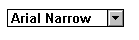
Fig. 8. The drop-down list box. There is no space between the entry area and the arrow button.
Searching
The text-entry area of a combo box has
two functions: searching and data-entry. The search
(or "jump-ahead") feature is useful when the list is
very long and scrolling takes too much time. Users can
search for items on the list by typing one character
(Fig. 9 and Fig. 10), or more than one if the combo
box is set up to do progressive searching (Fig. 11 and
Fig. 12).
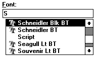
Fig. 9. In one-character searches, pressing
"S" goes to the first S item.
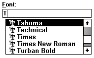
Fig. 10. Then pressing "T" goes to the first T
item. Suitable for
short lists with few similar items.
Fig. 11. In progressive searches, pressing "S"
also goes to the first S item.
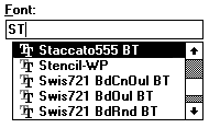
Fig. 12. Then pressing "T" goes to the first
ST item.
Use with long
lists or lists in which many of the items start with
the same first letter.
Once the item is highlighted, the user
can select it. The item is then displayed in the entry
area.
When to use progressive searches
Use progressive searching for long lists with many
similar items (in a progressive search, typing C+A+T
finds "Cat"). Another style of progressive search lets
users step through a set of items that all have the
same first letter (N+N+N finds "Nebraska," "New Jersey,"
and then "New York"). This style is also useful for
long lists.
Use single-letter searching only for short lists (C
finds "cat," A finds "apple," and T finds "tamarind").
Data Entry
The data-entry feature is useful when:
- The list is unfinished (you haven’t
captured all alternatives yet).
- You can anticipate some but not all
values that the user may want to enter.
- The list changes often (for example,
stock changes daily and the stock database may not
be up to date).
When to let users enter new items
A general usability rule is: Don’t force
users to pick items from a fixed list if the list is
incomplete. Aside from the frustration this creates,
if your users don’t have the information they need,
they may pick any item and thereby invalidate
your data-collection efforts.
For example, if your program insists
that every client entry have an SIC code (standard industrial
classification), but SIC codes are often missing from
the source material, typists who are under pressure
to enter hundreds of records a day are not going to
look up the client company and find its SIC code. They
are going to pick the first code on the list or pick
codes at random, just to get through the record.
Instead of creating situations in which
users are forced to pick incorrect items, let them enter
new codes. However, keep in mind that if you let users
enter new items, they may enter misspellings or synonyms
for items that already exist elsewhere on the list.
Whether you can let users enter wrong information depends
on the results of your task analysis:
- If the combo box entries affect a
corporate database, do the users have the authority
to add new items to the database?
- Can you save the data locally while
the user waits for an answer, then save it permanently
on the server once the supervisor validates the entry?
- Can you accept any entry, then do
a lookup and offer alternatives at the exit point?
As Carl Zetie says, "One of the major
conflicts in any application is balancing freedom against
constraint. Free taskflow allows the user to work as
he finds best. Constrained taskflow guides the user
to a successful conclusion" (1995, 91). For a detailed
discussion of methods for handling constraints, see
Zetie’s chapter 3, "Taskflow."
Size of the list
The size of a combo-box list has two
parameters: depth and width.
Depth or length
First, make sure you can do what you
want to do. Your development package (or other considerations)
may restrict the number of items on the list. Check
your specifications against your tools before committing
yourself to a combo box (or any type of list box). For
example, say you want to create a combo box for ZIP
codes (a good idea because the U.S. Post Office does
add ZIP codes occasionally). If your development kit
only lets you create 100-item lists, you can’t use a
combo box for ZIP codes.
Second, figure out where you want to
set the trade-off between ease of use and available
real estate. Research and experience indicates that
the more options you can display at once, the more quickly
users will select the correct item. Having to click
the drop-down arrow and scroll through the list slows
users down. However, the combo box’s search options
can mitigate some of these delays.
In general, the part of the list that
users see should be about seven items long. Go to 10
or even 20 items if the entire list is long—a longer
list may prevent users from closing the list box by
mistake, because they won’t be scrolling as much and
therefore won’t make a slip of the mouse (Leavens 1994,
287).
Width
Make sure that all items can be viewed
horizontally. If you can’t make the entry area or the
list as wide as the widest item on the list, make it
at least as wide as the average item. Then include a
horizontal scroll bar, make the width of the list dynamic,
or show the entire list item when the user touches it
with the mouse (like tool tips). Too many file-name
list boxes (for example) are so narrow that they show
only the first part of the path names and never the
file names. These lists are, therefore, utterly useless.
If your application may ever be internationalized,
keep in mind that items will expand. Design for automatic
text expansion wherever you can. See Label for information
on rates of expansion between languages.
Usability tests:
Make sure that users know that they
can type in the box as well as select from the list
of options. If you find that this feature is not apparent,
highlight it in your "getting started" documentation
and online help.
See also:
Drop-Down List
Box; List Box, Single-Selection; Spin Box. For information
on organizing lists, see List Box, Multiple-Selection.
Command
Line
An entry area from which users can run
commands and searches.
Good for:
Letting users define searches (Fig.
13).
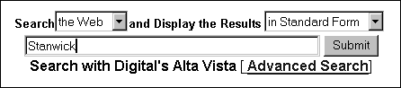
Fig. 13. A command line used for searching in Alta
Vista.
Providing shortcuts for expert or professional
users, especially in programming, spreadsheets, and
financial applications (Fig. 14). Typing can be faster
for experienced users.
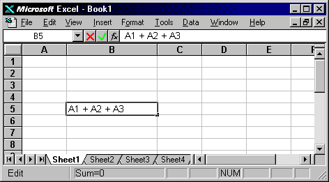
Fig. 14. The command line in Excel is the third
area from the top, where the statement "A1+A2+A3" appears.
Supporting already defined DOS and UNIX
batch files or scripts that perform repetitive or customized
work. Customers are usually not willing to give up their
script files (unless you are willing to rewrite them
as GUI macros).
Not good for:
Inexperienced or occasional users because
expert use depends on memorization, which generally
requires long-term familiarity.
Design guidelines:
One of the benefits of GUIs is visibility:
All available actions, for example, are made visible
in the menus. In the same way that recognition is more
effective than recall (memorization), GUIs, which show
users all choices rather than make them try to remember
a command, are more effective than command-line interfaces.
If there is no way to access an operation other than
recall, you cannot count on most users to remember all
the options.
Menus also give new users an intellectual
advantage. Test participants who are taught to use the
menus first and commands second, "fared better in their
overall knowledge of the functionality of the system.
Participants in the command language condition learned
only a limited number of task-specific functions" (Norman
1991, 317-318). In other words, although a command line
is a good tool, use it in addition to¾ not as a replacement for¾ menu access.
When to keep or add a command line
There are certain users for whom command-line
interfaces are suitable. Consider including (or retaining)
a command line when:
- Many of your customers are familiar
with the old command-line version of the program (Fig.
15). Including a command line may help ease them into
the new GUI version (OSF 1993, 6-14).
- The GUI adds too much overhead or
is too restrictive for expert users. For example,
people who normally use SQL to access databases are
not going to be happy with canned data views and queries
that require lots of mouse and button activity.
- The user has to type an entry anyway.
Typing the entry on a command line is much faster
than accessing the menu, opening a panel, typing the
entry, and then pressing OK or some other button.
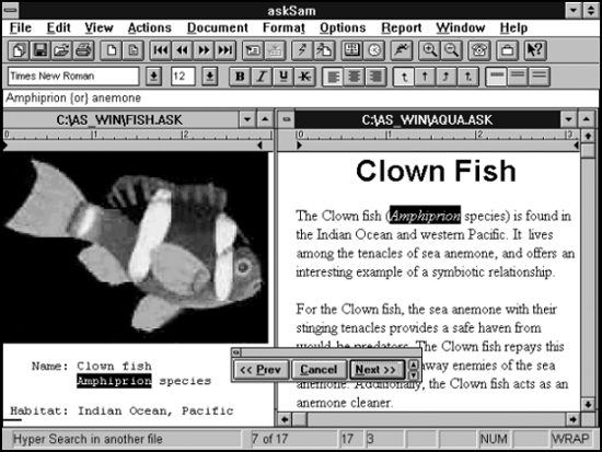
Fig. 15. The askSam command line appears below
the formatting toolbar (under "Times New Roman").
When askSam Systems ported askSam, a text
database program, from DOS to Windows, the company retained
the command line. According to Phil Schnyder, president
of askSam Systems, "In askSam, you can search for any
word by pressing one key to get into the command line,
typing the word, and pressing Enter. I've tried other
databases¾ you can put information in theirs just as quickly as
ours, but to get it out, you had to go through too many
dialog boxes." (We asked Schnyder if askSam's long-time
DOS users still used the command line to start programs
or access commands. "Not really," he said. "You get
tired of typing in the commands. It's easier to use
the menus than the command line for the programs.")
Analyze users carefully
Good deployment of GUI command lines
requires in-depth user analysis. It isn’t enough to
say, "Well, our audience is UNIX system administrators
and they really like command lines. So we won’t
bother about adding menus." The problem is that, even
if your audience is truly restricted to UNIX system
administrators,
- Not all commands are used equally
often—some are used once and then forgotten
- Many useful commands may never be
noticed
- Some of your commands may work differently
from what your users expect
- There may be a terminology mismatch.
You may use DEL as the delete command, but your users expect rm
Also, in spite of your expectations,
your audience may not be homogenous. End-users start
picking up shortcuts from the local gurus, and suddenly
everyone is mucking around in the guts of the application
and needing more support than you expected.
The solution is to find out which operations
are most likely to be used often and define command-line
shortcuts for those operations. Less popular operations
should be added to a menu system, bundled together into
macros or wizards, or described in detail in a readily
accessible help system. (Make sure that the help system
contains an index with lots of synonyms for the various
operations.)
Note that some applications offer command-line
functionality that is not available through the GUI,
says Steven Feldberg. "Typically, however, these are
systems that suffered the grafting of a GUI onto a prior,
command-driven interface. [But other types of] examples
abound, such as Access (or pretty much any database
product) that allows you to put inline commands from
the ‘Application Development Language’ into the command
line. Another example is searching via command lines
which often allows for complex Boolean expressions that
cannot be constructed via the GUI" (Feldberg, 1997).
It is probably a mistake to have hidden
functionality, but sometimes it can’t be helped. For
example, existing users may want to be able to use old
commands, but since you don’t want to support the old
functionality for new users, you don’t document it;
a function is new and untested, but it’s so cool you
want the digerati to try it anyway, so you mention it
at a user’s group meeting; your application has both
end-user functionality and a behind-the-scenes application
programming interface (API). Sometimes these disjunctions
are resolved by time—in other words, the old users die
off, the hidden functionality becomes public, the technical
writing department writes a separate API manual, thereby
letting your company package the end-user and programmer
versions separately. Nevertheless, for both usability
and support reasons, it is best to push the process
along as quickly as possible.
Where to put a command line
The Motif guidelines suggest putting the
command line at the bottom of the window or, if the
window also has a message area, just above the message
area (OSF 1993, 6-12- 6-13).
Windows 3.x and Windows 95 systems have
Run options on File (3.x) and the Startup (95) menus.
Spreadsheets put the command line below
the toolbars, to the right or middle of the window,
and above the cells.
Commercial financial applications seem
to put command lines at the top left just below the
menubar.
If there is any question about the right
location, test the various possibilities on users.
Usability tests:
Make sure that users both notice and
recognize the command line.
Find out which commands are actually
used and rank them by usage levels.
If appropriate, test whether users refer
to the commands the same way you do—for example, if
you create a delete command, do the users lean toward
RM, DEL, ERASE, or CUT? If there is no clear-cut winner,
set up aliases for the top three or four.
Also check the use of punctuation. For
example, how do your users indicate a Boolean AND on
a search command line?
BLACK AND WHITE
BLACK, WHITE
(BLACK WHITE)
BLACK + WHITE
BLACK & WHITE
black and white
Rank the styles and
make sure your program treats the most common ones as
synonyms. (The simplest way to do this is to make copies
of the commands and use all the synonyms as the names
of the copies. For example, in a DOS batch system, you
could copy DEL.BAT to RM.BAT, CUT.BAT, and so on.)
Note: BLACK + WHITE may seem really
wrong to you, but if users use +, and + isn’t used for
anything else in the system, you should consider using
it as a synonym. However, if it is used elsewhere and
you can tell that the command-line entry is not mathematical,
display an error message and teach the user something
helpful about the system.
See also:
Keyboard Shortcuts; Menu, Drop-Down.
Cursor
A character that visually indicates
the point at which the user’s next action will occur.
(Note that there are audio as well as visual cursors.)
Good for:
Text cursor: In text windows or entry areas, marks the insertion
point.
abc|de
Selection cursor: For objects, indicates what has been selected (Fig.
16).

Fig. 16. The lasso is the selection cursor; the
outline
is the selected area. (Cursor from CorelDraw.)
Design guidelines:
Text cursors come with the operating
system and in development kits; they do not have to
be designed.
A selection cursor is a more of a visual
effect than a cursor. It indicates the location at which
the next keyboard event will occur.
Since a cursor is a form of feedback,
the only design issues are whether the user can spot
the cursor and whether the cursor gets in the way of
the user’s action.
Usability tests:
If you have designed your own cursor
or have modified the system’s text cursor in some way,
observe users carefully to make sure that:
- They can see the cursor. For text
cursors, check the size and the default blinking rate.
- It doesn’t get in their way when
they try to do something. (It is more likely that
a pointer will cover text or another item, however.)
Most platforms let users change standard
cursor shapes and sizes at the operating-system level.
You might want to add this functionality to your own
cursors as well.
See also:
Pointer.
|
