|
You are here: Home ~ Desktop UIs ~ Radio Buttons - Status Bar
Radio Button
A button used to turn mutually exclusive
settings on and off. Users can set only one radio
button at a time. Radio buttons are usually round
(in Windows) or diamond-shaped (in Motif).
Good for:
Selecting only one setting from two
to six possible settings (Fig. 1).
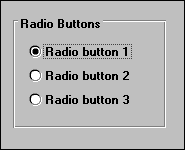
Fig.
1. Radio buttons.
Letting users toggle between two states
when the states are not opposites or easily inferred
from one another (Fig. 2).
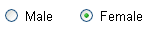
Fig.
2. A radio-button toggle.
Not good for:
More than six or seven settings at
a time. Use a single-selection list or a drop-down
list box instead.
Starting programs or opening dialog
boxes. Use pushbuttons instead.
Switching between two views of the
same data. Use tabbed windows or dialog boxes instead.
Design guidelines:
Grouping and arranging radio buttons
Radio buttons naturally come in groups
(except for toggles, described in "Creating
a toggle" below). Box or frame each group of
related buttons and give each group a descriptive
label (Fig. 1).
Organize the group by frequency or
task order, logically or alphanumerically. See "How
to organize lists" in
List Box, Multiple-Selection, for additional ideas.
How many radio buttons are too many?
When you get more than six settings,
switch to a single-selection list. Otherwise, the
buttons start taking up too much room on the window
or dialog box.
Pick a default button
One radio button must always be in
selected mode, even when the user first opens the
application. As the window’s developer, you must
pick a default button. Also, since one button must
always be on, users cannot choose "none of the
above" unless you provide one.
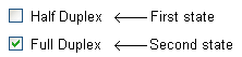
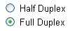
Creating a toggle
Both check boxes and radio buttons
can function as toggles. Here, for example, is a
typical check box toggle:

This is fine for a yes/no, on/off choice.
However, what about a toggle like this?

What is the opposite of full duplex?
To the uninitiated, probably empty duplex. For modem
experts, however, the right answer is half duplex.
One solution is to change the label depending on
the setting, but that becomes confusing for two reasons
(Microsoft 1995a, 138):
-
Changing labels makes the interface
seem inconsistent, which is a usability failure.
-
Until the user clicks the button
a few times, he or she may not realize that clicking
sets the other state, not the state shown
on the label:
You can’t solve the problem with two
check boxes, since then the user can set both states
at the same time or none at all. Rather, the solution
is to use two radio buttons:

Arranging radio buttons
You can arrange radio buttons horizontally
(in rows) or vertically (in columns). Vertical is
better since it’s easier to scan—just make sure that
you align the buttons.
If you have to use a horizontal arrangement,
leave enough space between buttons so that users
are not confused about which label goes with which
button (Wilson 1997).
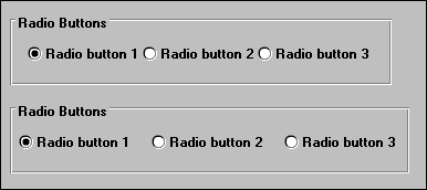
Fig. 3. Too close and
not too close.
Usability tests:
To find out what the default button
should be and whether you need a button meaning "none," first
check your specifications and taskflow documentation.
Then test the choices with a low-fidelity or high-fidelity
prototype. Listen for statements like, "How
do I turn off all these buttons?" If you hear, "How
do I get the default back?" ask which button
should be the default.
See also:
Check Box; Drop-Down
List Box; List Box,
Single-Selection.
Scroll Bar
A narrow rectangular area consisting
of a scroll area, a scroll box, and arrows or anchors
at either end that is used to represent the user’s
relative position in a document, file, or list. Scroll
bars can be vertical or horizontal.
Good for:
Viewing information that is beyond
the edge of the scrollable object (list, window,
or dialog box).
With a split bar, letting users see
two parts of the same file at the same (Fig. 4).
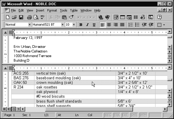
Fig.
4. Scroll bars and a
split bar.
Not good for:
Applications that require tiling two
or three windows vertically on the screen (Fig. 5).
The scroll bars take up too much room. Use slide
bars instead.
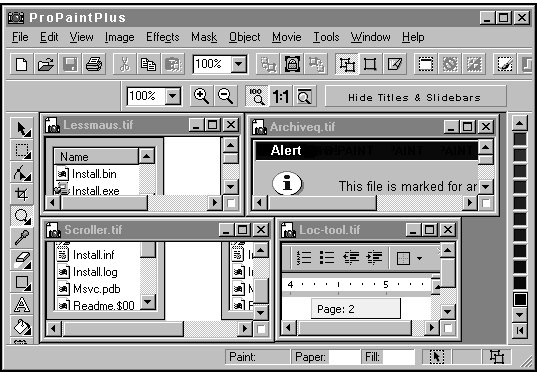
Fig.
5. Too much screen furniture.
Setting values—don’t confuse a scroll
bar with a slider. See Slider for details.
Design guidelines:
Gray or take away?
Scroll bars can be set up to:
-
disappear if the scrollable object
isn’t wide or long enough to scroll
-
always appear but be grayed out
if the object is not scrollable
-
always appear (without graying or
any other indicator)
In general, users think of disappearing
and reappearing screen components as unreliable.
However, since scroll bars are more like furniture
than equipment, they probably aren’t even noticed
until they’re needed. Suggestion: Pick one method
(the easiest, say) and stick with it throughout the
interface.
Length of the list
Applications have indicated the length
of and the user’s location on the list (or other
scrollable object) in at least two ways (Fig. 6):
-
The scroll box sits at or moves
to a spot on the bar proportional to the length
of the list or document and the user’s location
in the list or document
-
The scroll box itself is proportional
in size to the length of the list or document.
By its size, it indicates the proportion of information
currently visible.
Fig.
6. Two ways to indicate
the length of a scrolled list:
the scroll box’s
position on the scroll bar
or the size of the scroll box.
Your platform guidelines or your development
environment may pick the method for you. Usability
testing will tell you which method makes the most
sense to your users.
However, no scroll bar or other component
can indicate how long the list is when the application
itself doesn’t know (when a list is first loading,
for example). Rather than trying to change the scroll
bar or invent a new widget, just let users know that
there may be a delay in showing the size of the list.
(Use a status message that doesn’t require a user
response.) If you can let the user do his work while
the rest of the list loads, you will probably have
solved the only important problem—being forced to
wait.
Width of items
When you create a scrolling list of
items, you may find that some of the text is too
wide to fit. Important parts of long path names or
long file names (in Apple systems and now in Windows
95) may thereby be cut off. You can solve the problem
in these ways:
-
Use tooltips that show the entire
name when the pointer hovers over the truncated
name.
-
Make the list wider. If the widths
of the lists may vary by customer site—for example,
customers with client/server systems have long
path names, those with stand-alone systems have
short path names—consider making the lists resizable.
-
Eliminate text in the middle of
the item and insert ellipses (…) there to preserve
the beginning and end of the item names.
-
Add a horizontal scroll bar to the
bottom of the list.
Split bars
The split bar is a nearly invisible
feature—as well it should be since most users won’t
need it (Fig. 7 and Fig. 8). However, for those who
do, splitting a window into panes lets users have
multiple views of a single object. (This is a different
type of task from having more than one window open
at the same time, although the operation is basically
the same.)
Some situations in which multiple views
are helpful are:
-
Being able to work on a blown-up
section of a graphic in one pane and see the effect
on the normally sized graphic in another pane
-
Looking at footnotes in one pane
and text in another
-
Copying information from one part
of a document to another
-
Comparing two parts of the same
object
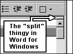
Fig.
7. The user clicks the
split bar and drags...
Fig.
8. The newly split window.
Better location information
Some applications, including Microsoft
Word 97, now show additional location information.
When users click on the scroll box (but not the arrow
keys), a tooltip with the heading of the current
location appears (Fig. 9). In long files or documents,
this is very helpful.
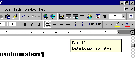
Fig.
9. A location tooltip.
Difficulties with scrolling
Novice windows users may have difficulty
understanding how windows work. The chosen development
idiom is that the window moves around over data that
is fixed in position (the "telescope approach").
This means that the data in a window moves opposite
to the direction indicated by the arrow button or
the scroll box.
However, users often assume that the
arrows will move the data in the same direction as
the directional arrow or scroll box—in other words,
users think that the data moves under the window,
not the window over the data. Why this happens, no
one knows. Perhaps it is because users conclude that
the data must be moving because the window stays
still; or since scroll bars are close to the data,
the arrows must be acting on the data, not the window
(Galitz 1997, 407).
Another difficulty, even for experienced
users, is the amount of mouse movement needed to
use scroll bars, since the arrow keys are at opposite
ends of the scroll bar (Cooper 1995, 199). Why not
put them together? For example, see Fig. 10.
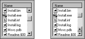
Fig.
10. The second scroll bar, with the arrows together,
requires less mousing than the first.
Usability tests:
Here are some tests for inexperienced
window users:
-
If your user profile indicates that
the users are inexperienced with windows, see if
the test participants recognize the function of
the scroll bar.
-
With talk-aloud protocols, find
out what conceptual models users bring to looking
beyond the edge of the screen. See "Difficulties
with scrolling" above.
-
If splitting a window into panes
is an important part of the application, make sure
that users recognize the split bar. Also make sure
they know how to unsplit a split window (this is
usually a menu option).
Share the results with your training
and documentation departments.
Check item widths
During the high-fidelity testing phase,
ask the test participants for typical item names.
If the list may contain path names, find the longest
possible path name as well. Then make sure either
that the list box is wide enough to accommodate the
longest name or that you’ve included a horizontal
scroll bar or ellipses in the center of the names.
Check whether users need slide bars instead
When users are moving from very dense
terminal-based or character-based systems to GUIs,
make sure that you don’t unintentionally narrow their
views of the information. During tests of high-fidelity
prototypes or beta versions, listen for complaints
that there isn’t enough information on the screen
or that the scroll bars and other furniture are blocking
the users’ view of the data. You may need to replace
the scroll bars with slide bars or let users toggle
off all screen furniture (see Slide Bar for more
information). Use experienced users as test participants;
new users may not realize that information is missing.
See also:
Slide Bar.
Slide Bar
A very narrow version of a scroll bar.
Good for:
Situations in which space is tight,
either because the window is very dense or because
the main window has to hold many subwindows or panels
(Fig. 11).
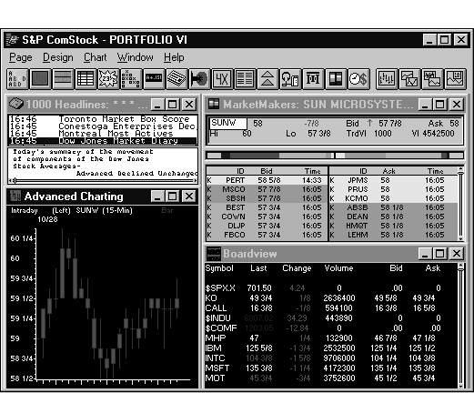
Fig.
11. A window with slide
bars instead of scroll bars. They appear at the
bottom of the headlines panel
and on the right edges of the rightmost panels.
Not good for:
Occasional or one-time-use applications.
Slide bars are too subtle for transient applications.
Any user population without the fine
motor skills needed to manipulate the small scroll
box and arrow buttons.
Design guidelines:
When users are moving from very dense
terminal-based or character-based systems to GUIs,
all the GUI apparatus may unintentionally narrow
their views of the information, especially if there
are many panes or secondary windows on the main window.
(News and financial data applications often tile
a dozen windows of various sizes and shapes on the
screen at once.)
Consider eliminating even the slide
bars: Let users toggle all screen ornamentation on
and off. While they set up their windows, they can
have the scroll bars and window titles on. Once they’re
done setting up, they can turn everything off. For
more scrolling guidelines and information, see Scroll
Bar.
Usability tests:
On a high-fidelity prototype, make
sure that the user population has the manual dexterity
to click on and drag the small slider. If they can’t,
try making the hot spot larger than the slider. The
slider itself can be made larger if it doesn’t obscure
live information.
See also:
Scroll Bar
Slider
A scale or scrolling bar that lets
users select a value from a continual range of values.
An indicator shows the current setting.
Good for:
Incrementing or decrementing continuous
values. Sliders can be read-only or read-write (Fig.
12).
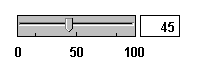
Fig.
12. A slider with an
entry area.
Selecting one value or point from an
infinite number of values or points.
Not good for:
Precise entries (unless the slider
component also includes an entry area for exact values,
as shown in Fig. 12). Use a list box or combo box
instead.
Situations in which the range is not
continuous.
Fewer than 10 choices. Use a spin box
instead.
Design guidelines:
A well-designed, well-thought-out slider
can be an excellent way to map real-life functionality
to a software interface. For example, an online thermostat
is much more intuitive if you let users raise or
lower the temperature by dragging and dropping rather
than typing. Just make sure that the values on your
slider increase or decrease in some well-known, predictable,
and easily understood way.
Show the result of a shift numerically—percentages,
size, etc.—or visually. For example, if your application
has a color wheel on which users can change colors,
show how the color palette has changed.
Let users type an entry or adjust the
setting by typing. This offers them the best of two
worlds—a slider for the big changes, an entry area
for fine-tuning (Fig. 12).
Sliders are not scroll bars
Don’t confuse a scroll bar with a slider.
See Fig. 13.

Fig.
13. A scroll bar vs.
a slider.
Labeling sliders
Make sure that the slider’s labels
give the units of measurement. Galitz also offers
these guidelines (1997, 399-400):
-
Mark the low, intermediate, and
high ends of the scale.
-
Provide interval markings in consistent
increments.
-
Let the user change the units of
measurement.
Read-only vs. read-write
If the user can change the value shown
on the slider, provide a slider box and arrow buttons
(like scroll bars). If the user cannot change the
slider, do not provide the slider box or arrow buttons.
Instead, fill the bar in some visually distinctive
way to indicate the value.
Fill vertical sliders from bottom to
top. Fill horizontal sliders from left to right.
If you intend to internationalize your software,
keep in mind that, in some Asian languages, left
may indicate higher values and right may indicate
lower values. Check with your local representatives.
Usability tests:
Brainstorm to find potential sliders.
Look for opportunities to replace entry areas with
sliders during low-fidelity prototyping.
However, keep in mind that sliders,
although easy to understand, take up more room onscreen
and are less precise than simpler entry areas. If
you are creating an application with which users
will spend a lot of time, make sure that you test
the ideas on experienced users before you
start coding. (If your application comes and goes,
on the other hand, use as many sliders as you can.
They are helpful because the mapping between the
real-world operation and the GUI is usually direct.)
Make sure that users can select an
exact value easily. Don’t pack the slider so tight
that it is hard to stop the indicator on an exact
value. Adding an entry area will let users make fine
adjustments.
See also:
Spin Box
Spin Box
A one-line entry area with up and down
arrows at one end. Users can either click the arrow
buttons or type a choice.
Good for:
For applications with limited screen
space, setting predictable, customary, or consecutive
values (numbers, days of the week, and so on) with
the mouse (Fig. 14).
Fig.
14. A standard spin box.
Not good for:
In a non-editable spin box, more than
10 increments. Having too many increments forces
users to click for long periods of time. Use a combo
box or a slider instead.
Situations in which users need to compare
the choices and therefore need to see them.
Users with limited patience or manual
dexterity (for example, laptop users or children).
The arrows are small targets and therefore hard to
hit.
Design guidelines:
Always add an entry area. Let users
enter their own numbers as well as select them with
the spin buttons.
Maximum number of choices
Weinschenk and Yao recommend keeping
the list to under 10 choices (1995, 18). Although
this makes sense for non-editable spin boxes, an
editable spin box naturally accommodates more choices.
The spinner becomes a secondary input device.
Labeling spin-box increment buttons
One problem with spin boxes is that
users sometimes can’t tell whether the up arrow increments
or decrements the values. For example, it may not
be obvious which direction the year will move in
Fig. 14. Clicking the up arrow might change the year
from 2010 to 2011 or from 2010 to 2009. Using a plus
and a minus rather than the standard arrows might
be a better design (Fig. 15).
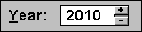
Fig.
15. Better labeling for
a spin box.
If the range is limited, put that information
in the label. For example, if the range of priority
levels is between 1 and 10, write the label as "Priority
(1-10)."
Usability tests:
Test for appropriate increments and
increment sizes.
Watch for difficulties manipulating
the arrow buttons. They are small targets and easy
to overshoot.
Test that your chosen order actually
makes sense to users. "Customary" is not
always the same, especially internationally.
See also:
Drop-Down List
Status Bar
An area at the bottom, or occasionally
the top, of a main window that displays information
about the current state of what is being viewed in
the window or any other contextual information, such
as keyboard state (OVR vs. INS, for example). It
may also contain progress messages and screen component
definitions.
Good for:
Giving feedback on modes (CAPS, NUM,
etc.) and location (page number, window identification).
See Fig. 16.
Offering system or application messages
that do not require user response.
Showing descriptions of components
when the user holds the mouse pointer over each one.
Note: When the development environment allows,
What’s This? help and extended tooltips are better
tools for object identification.
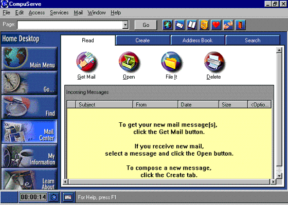
Fig.
16. A status bar from
CompuServe 3.0.1.
Not good for:
Object help that is better handled
with tooltips.
Important or critical messages that
require a response. Users may not notice status-bar
messages. Use a message box instead.
Design guidelines:
Responding to the question, "Have
you done any testing (or know of any) that indicates
whether users actually read [status-bar] messages?" Jared
Spool, usability expert, said (1996):
Our research is very clear on this.
Users almost never see bottom-line messages. The
larger the screen, the more likely they will miss
any important messages.
This has to do with the focus of the
user’s attention. When the users are exploring menu
items at the top of the screen, they don’t notice
changes to the bottom of the screen.
Lotus (amongst others) tried putting
the messages in the top window banner, but that only
had a negligible effect.
Spool goes on to say that tooltips
were more effective. When Excel 4.0 without tooltips
was replaced with Excel 5.0 with tooltips,
icon usage jumped significantly.
Status messages, defined
Status messages are a running commentary
on an application's activity. For example, as a program
loads, the status message might be "Loading database...." As
the program searches, the message might be "Searching
for matches...." Once the program has results, the
message might be "23 records found."
Status messages are used to indicate
either progress toward a goal or the accomplishment
of that goal. Progress messages are important when
response times may be slow or changeable, while acknowledgment
messages are important when a process is not visible
to the user (it's running in background, say) or
when a process takes so long that the user may have
turned away from her computer before it has finished.
Once users know what to expect for
particular tasks, variability in response
times can also create anxiety and dissatisfaction.
Variability can occur in either direction: A response
that is suddenly too fast causes as much anxiety
as one that is too slow (Galitz 1994, 432). The anxiety
comes from uncertainty¾ "Did
the process I asked for work?" or "Why is this taking
so long? Did I break something?"
As well as providing feedback, therefore,
status messages help mitigate the effects of too-long
or too-short response times. Users tolerate delays
when they know how long the process will take and
that the process is, indeed, still continuing. They
will tolerate too-fast responses if an acknowledgment
message shows that their request was actually acted
upon.
How to write status messages
The messages have to be short because
the available space is so small. Feel free to use
sentence fragments and implied subjects, objects,
or predicates. In progress messages, the action (predicate)
is usually more important than the subject or object
(see Fig. 17). In acknowledgment messages, the object¾ the
result¾ is usually
the most important (see Fig. 18).
Retrieving
records…
Fig.
17. The action, "Retrieving," comes
first in a progress message.
23
records found.
Fig.
18. The result often
comes first in an acknowledgment message.
If you are going to internationalize
the interface, keep in mind that text will expand
by at least 30 percent, maybe as much as 200 percent.
(See Table n, "Expansion Rates Between English
and Other Languages" in Label.) Keep the status-bar
messages in resource files to make translation easier.
Punctuation
Use colons to indicate "as follows." For
example:
Connected:
23 minutes.
To indicate time passing, use an ellipsis
(three periods) at the end of the word or phrase:
Searching...
If the process continues for more than
a few seconds, continue to add dots or to cycle through
dots: one dot, then two dots, then three dots, then
back to one dot.
Who should write status messages
Even though creating status-bar descriptions
and messages are development tasks (they are attached
to the buttons, menu options, or processes that call
them), ask your technical writers to write or edit
them. Technical writers will make sure that the messages
are grammatically correct, spelled correctly, and
consistent from one part of the application to another.
No matter who writes the messages,
remember to proofread them. There are often misspellings,
missing spaces between words, strange capitalization,
and a lack of¾ or
too much¾ punctuation.
Usability tests:
When testing prototypes (low- or high-fidelity),
note points at which the test participants seem to
be looking for more information. Ask them what they
can’t find.
In high-fidelity prototypes or beta
versions, see if the participants ask questions that
can be answered by status information that they are
not noticing.
See also:
Message Box; Progress
Indicator; Tooltip.
|