|
You are here: Home ~ Desktop UIs ~ Fields
Field,
Entry
An area that lets users enter and edit data. Depending
on the type of application, data-entry fields allow
users to enter, edit, and save database and system information
or to enter values for analyses. Some applications also
use fields to run searches—for example, the user can
enter a last name, Social Security number, or other
key data, and then click Search to find a particular
record. A subcategory of the data-entry field is the
multiple-line field.
Good for:
For database operations, letting users create or change
records (Fig. 1). The entries are saved on permanent
storage media.
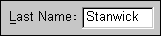
Fig. 1. Database field. For analysis operations, letting users run calculations
and analyses (Fig. 2). The entries are usually not saved.

Fig. 2. Input area for part of an analysis. For system-level utilities, letting users save file
names and other system information (Fig. 3).
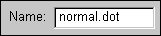
Fig. 3. Entry area for a file name. Running commands.
Use command lines instead.
Entering fixed kinds of information. Rather than making
users type the same information repeatedly, use combo
boxes, lists, check boxes, or radio buttons instead.
Design guidelines:
Note that data-entry, required, and protected fields
overlap. Required fields are a type of data-entry field,
and protected fields can change from protected to entry,
depending on which business or data-integrity rules
are in effect.
Visual design for data-entry
fields
Entry fields
should look like they accept data. Create this effect
by
- Providing a frame or box for
the entry area
- Using a beveled border that makes
the field look inset (Marcus 1995, 141)
- Using a different, lighter color
for the entry area so that it contrasts with the background
- Except for passwords, always
displaying the user’s entries as he or she types them
Other general design guidelines:
- When a field appears, it should
either be empty or contain an initial default value.
(See Field, Required, for more information on default
entries.) If the field contains a value, the value
should become selected (and therefore editable or
replaceable) when the cursor enters the field.
- Provide a label. However, because
the data are more important than the labels, make
sure that the labels are smaller, lighter, or less
visible than the data (Bellcore 1994, 5-46). See Label
for details on label location and text case.
- Group related fields. See Label
for field layout guidelines.
Disabled entry fields
Sometimes fields become unavailable
or disabled temporarily (because of business or data-integrity
rules). When fields are temporarily disabled, follow
these guidelines:
- If users cannot change the contents
of a field temporarily, turn the contents gray but
do not change the color of the entry area.
- If the field itself is temporarily
unavailable, gray out the label and background of
the entry area (Marcus 1995, 141; Weinschenk and Yao
1995, 33).
Note that, in contrast, permanently
protected fields use the window’s background color for
their data areas and have no beveled edges.
Width of entry areas
It used to be that picking field
widths was easy—in a monospaced-font interface, the
entry area was the same width as the field. With the
arrival of proportional fonts, however, the widths of
fields and their entry areas parted company (Fig. 4).
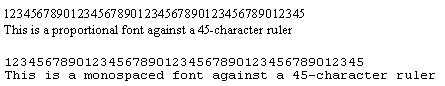
Fig. 4. The difference
between monospaced and proportionally spaced entry areas.
To pick the appropriate entry-area
width for a variable-length field:
-
Find the field size, if you
haven’t already done so, by averaging the lengths
of typical sample data.
-
Create a text box, then type
the average number of characters (a series of lowercase
n’s will do) into it. Adjust the width of the box
until you can see all of the characters at once.
You can make the actual field longer provided that
you let the user navigate left and right beyond
the edges of the displayed area. Keep in mind, however,
that users dislike horizontal scrolling in fields.
If you are going to internationalize
your interface, make sure that you repeat the average-field
length tests for entries in the target languages. These
entries can be 30 to 200 percent longer than their English
counterparts. See Table xxx in Label for details.
To find the best width for fixed-length
fields (which are usually codes), create a text box
for the field, then type in as many uppercase Ms (the
widest letter in the Latin alphabet) as the code requires.
For example, for a two-digit state field, you’d type
MM. If the last M isn’t cut off, the entry area is the
right size.
When the widths of a number of fields
are similar, match the widths rather than defining customized
widths for each one. However, keep in mind that the
size of the entry area signifies the data length to
users. Don’t be tempted to make entry areas too short
or too long only for aesthetic reasons (Weinschenk and
Yao 1995, 33).
Multiple-line fields
Most data-entry fields do not let
users change the text font or size or enter more than
one line of data. The exception is the multiple-line
field, which let users type, edit, and read passages
of text. Typical uses include e-mail messages and text
files (Galitz 1997, 340; Microsoft 1995a, 159).
Multiple-line fields, especially
those defined as "rich-text fields," can be printed
and have OLE functions—for example, you can let users
show part of a spreadsheet in the field (Microsoft 1995a,
159).
Justification
Don’t force users to right-justify
or left-justify entries themselves.
-
If the entry is alphabetical,
left-justify it.
-
If it’s numeric, right-justify
it.
-
If it’s decimal, justify the
entry around the decimal point.
Also don’t force users to enter
leading zeros and don’t force them to change the text’s
case themselves (Bellcore 1994, 5-47).
Note: Different writing systems
have different justification rules. For example, Hebrew
and Arabic writing systems are bidirectional¾ text is
entered and displayed from right to left, but numbers
(and any Roman-alphabet words) are entered and displayed
from left to right (Apple Computer 1992, 105-107). See
Fig. 5.

Fig. 5. A sample, done in English, of bidirectional
text.
Note that the number is (within the context) reversed.
For more information on internationalization
issues, see Fowler and Stanwick, 1995, chapter 6, "International
Software" (1995, 241-242).
Keyboard navigation and usage
Users must move between fields and
inside fields. Guidelines for moving between fields
are:
-
Provide mnemonics (see Keyboard
Shortcuts for details). Put the access-key underline
on the label, but when the user presses the access
key, put the cursor in the live entry area (Microsoft
1995a, 157).
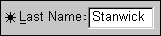
Fig. 6. "L" is the mnemonic for the
"Last Name" field.
-
Use Tab, Shift+Tab, and the
up and down arrow keys to move between fields (Microsoft
1995a, 157; Digital 1995, 253).
-
If the users are familiar (from
character-based interfaces) with pressing Enter
to move between fields, also allow Enter even though
it might seem like un-GUI behavior. Carolyn Snyder,
usability expert at User Interface Engineering,
points out that it’s "not true that Microsoft has
‘invalidated’ using the Enter key. In some Windows
products (Microsoft Money being one), the user can
set a preference to navigate with Enter rather than
Tab." Having this option is important, she says.
"I have seen users accustomed to a DOS-based system
get all hung up over the Tab/Enter thing because
hitting Enter has become such a reflex for them.
This sounds like a trivial thing, but I've seen
it cause new users significant difficulty" (Snyder
1997).
Guidelines for moving inside single-line
fields are:
-
The left and right arrow keys
move the cursor left and right by one character.
-
In fields containing multiple
words, Ctrl+ß moves the cursor to the beginning
of the previous word. Ctrl+à moves the cursor
to the next word (Digital 1995, 252).
-
The Begin or Home key moves
the cursor to the beginning of the line or field.
The End key moves the cursor to the end of the line
or field (Digital 1995, 252). An alternate is Ctrl
+ left or right arrow (Marcus 1995, 141).
Guidelines for moving inside multiple-line
fields are:
-
The up and down arrow keys move
to the previous or next line (note that in single-line
fields, the up and down arrows move to other components).
-
The left and right arrow keys
move the cursor left and right by one character.
-
Ctrl+ß moves the cursor
to the beginning of the previous word. Ctrl+à
moves the cursor to the next word (Digital 1995,
252).
-
The Begin or Home key moves
the cursor to the beginning of the line or field.
The End key moves the cursor to the end of the line
or field (Digital 1995, 252). An alternate is Ctrl+ß
or Ctrl+à (Marcus 1995, 141).
-
Ctrl+Begin or Ctrl+Home moves
the cursor to the beginning of the file. Ctrl+End
moves the cursor to the end of the file.
-
Use double-clicking to select
individual words (Digital 1995, 253).
-
Use Tab for indenting (Digital
1995, 253).
-
Use Return to insert a carriage
return. The Digital guidelines suggest using Enter
or Ctrl+Enter to invoke the window or dialog box’s
default action. This requires a keyboard with both
Enter and Return (Digital 1995, 253).
Note that, if the window or dialog
box has a default pushbutton activated with Enter, you
may need to disable default access as long as the cursor
is in the multiple-line field.
Cut, paste, undo, redo
Applications should, at a minimum,
allow cut, copy, and paste operations using the standard
accelerators (Ctrl+X for cut, Ctrl+C for copy, and Ctrl+V
for paste). Toolbar cut, copy, and paste buttons are
always helpful.
Provide a method for selecting data
using the keyboard (not just the mouse). The Digital
guidelines suggest Ctrl and spacebar (1995, 253). In
Microsoft Windows 3.x and 95 programs, Shift plus the
left and right arrows select text.
When using Delete or Backspace,
Microsoft recommends that the application not put the
cut text in the Clipboard. Instead, provide at least
one level of undo (1995a, 63).
Insert and overtype
If the field supports replace mode,
use the Insert key to toggle between insert and overtype
mode (Digital 1995, 253; Microsoft 1995a, 63). For insert
mode, use the text insertion cursor. For overtype mode,
use a block cursor on top of the current character and
reverse-highlight the character (Microsoft 1995a, 62-63).
You can define multiple-line
fields to accept paragraph breaks and font changes.
Make sure that you support wraparound. Do not force
users to enter their own line breaks or to type out
of view—past the borders of the entry area—even if you
supply scroll bars (Bellcore 1994, 5-47).
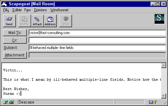
Fig. 7. An ill-behaved multiple-line field.
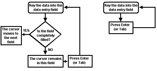
Auto skip
"Auto skip" or "automatic return"
makes the cursor move automatically to the next field
as soon as the last character in the previous field
is completely filled. Theoretically, since auto skip
eliminates pressing Tab or Return, it should be faster
than manually tabbing between fields. However, it is
not faster for data-entry personnel working on "heads-down"
form-based data-entry windows. (See Windows for the
three types of windows.)
Professional data-entry personnel
have two characteristics that make auto skip problematic:
They are usually touch typists and they rarely look
at the screen while they work. Since not all fields
are completely filled, the typists often have to stop,
check the screen to find out where the cursor is, then
either tab to the next field or just start typing again.
For example, Fig. 8 shows auto skip
under ideal circumstances. The typist fills in the street
address, presses Tab, types the two-character state
abbreviation, and the cursor jumps automatically to
the ZIP code field.
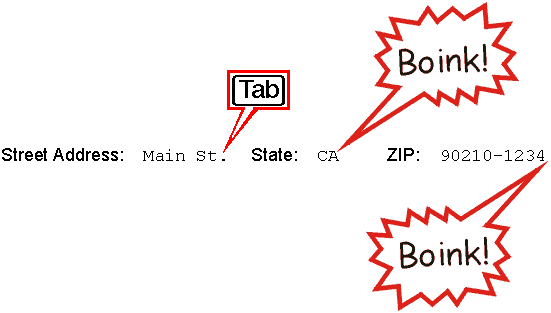
Fig. 8. As long as the state is filled in completely,
the cursor jumps automatically to the next field.
Fig. 9 shows what actually happens much of the time.
The street address is too long, but the typist isn’t
looking at the screen and doesn’t notice. He continues
typing, but now he’s in the state field, which accepts
the two letters (no editing) and moves the cursor into
the ZIP code field. Since the ZIP code field doesn’t
accept letters, it beeps, finally breaking his concentration.
At this point, he has three bad entries to fix.
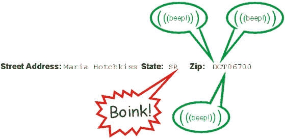 Fig. 9. An auto skip failure. Like skiing or ice-skating, touch-typing is most satisfying
when its practitioner can get into the flow. Auto skip,
unfortunately, breaks that flow. Wilbert O. Galitz found
in a 1972 study that "auto skip, while requiring fewer
keystrokes, was found to result in longer keying times
and more errors than manual tabbing because it disrupted
the keying rhythm (1997, 151). It also requires learning
and constant analysis, as he demonstrates in Fig. 10.
Auto skip is also contraindicated
when employee turnover is high and when users don’t
spend significant amounts of time doing data entry.
New hires might have trouble learning the navigation
style; infrequent users might have trouble remembering
the rules and the codes.
However, auto skip can be helpful
in either of two situations: if every field on the window
is fixed-length or if the application uses a "heads-up"
conversational-type window.
When every field contains a fixed-length
code, the application need not make the experienced
data-entry typist press Tab or Enter. Keep in mind,
however, that the inexperienced user who has yet to
memorize all the codes may have trouble keeping his
or her place. If usability tests indicate a problem,
let these users switch from manual skip to auto skip
when they feel they’ve gotten up to speed.
A typical conversational application
is a word processing program or a telephone reservations
system. Since the data-entry personnel are looking at
the screen while they input information, they see the
auto skipping occur and therefore don’t lose track of
the cursor location.
Auto fill (auto-complete) is a good
alternative to auto skip. See "Transformations and edits"
below for details.
Data-entry and touch typists
If your users complain about having
to use the mouse too much, find out if they’re touch-typists.
Touch typists like to keep their hands in the home position
(on the middle row of keys, from A to F and J to the
colon). They do not like to switch between mouse and
keyboard. Accommodate touch typists by
-
using the standard set of mnemonics
(Ctrl+S for save, Ctrl+C for copy, and so on),
-
making sure that all lists use
combo boxes (with combo boxes, you can either type
or select an entry from the list), and
-
making sure that all check
boxes can be set by typing a letter or number (X,
Y, or N, M or F).
Data error prevention and correction
Where there is data entry, there are errors. One of
the reasons that your application uses field edits is
to prevent and, if necessary, handle errors.
You can prevent misunderstandings by building your
interface around the users’ conceptual models (see Appendix
A). You can make some errors unlikely by editing the
data and by improving visibility, feedback, and mapping
(matching computerized and actual items—for example,
using an onscreen thermometer to set a temperature).
You can prevent other errors by the judicious use of
constraints. Once you’ve done as much prevention as
you can think of, then you can offer graceful recovery
methods.
Transformations and edits
To design fields most effectively,
you must map the system model (in a database, columns,
rows, data, flags) to the user’s conceptual model (what
stock is available, what needs to be reordered, what
should be sent back to the manufacturer). In other words,
your application must accept whatever seems sensible to the user as input (input transformation);
display whatever makes sense to the user as output
(output transformation); and constrain only when constraint
is more efficient for the user (one-to-one transformation).
An input transformation is
what many developers would call an edit. Carl Zetie
(1995) uses dates as typical candidates for input transformation.
For example, each of these dates are the same, if you
accept that some are European versions of December 5,
2000:
-
12/5/00
-
12/5/2000
-
12-5-2000
-
05-12-2000
-
December 5, 2000
-
5 December 2000
In a well-mannered application,
the user would either know exactly which of these formats
to use (because the label or the field says so) or the
application would accept any of them. (For more on dates,
see "Date formats" below.) The input is then transformed
twice—once to its internal representation, which is
usually the number of days since an arbitrary starting
date; and secondly to its display or output state—for
example, 12/05/00 (Zetie 1995, 79).
An output transformation extracts meaning from a mass of data. An output transformation
generally starts with a totality of information from
a database or analysis, but ends with a display of only
the most significant points.
For example, an inventory system
might "know" that the level of a particular item is
so low that it is triggering a reorder and that crates
of an out-of-stock item are waiting to be unloaded into
the warehouse. However, no matter how much information
it may have, the system will—correctly—show only that
some items are deliverable and some aren’t. A sales
clerk sees the available items in blue (not shades of
blue corresponding to how available they are) and unavailable
items in red (not shades of red). The output transformation
pulls just the necessary information from the entire
universe of information. "Choosing a good output transformation
is always a question of reducing the information presented
to the user to everything that she needs to know, but
no more" (Zetie 1995, 79).
A one-to-one transformation means that there is a one-to-one correspondence between
the user model and the system model—in Solitaire, for
example, the cards in the user’s mind match the cards
on the screen. In a user interface, replacing a yes/no
question with a checkbox would be a one-to-one transformation.
In a printout, displaying the stock items’ names rather
than their catalog numbers (the sales clerk’s input)
would be another type of one-to-one transformation.
One-to-one transformations are more
appropriate than standard input transformations whenever
"it is useful to force the user to a single way of expressing
an input. For example, replacing a yes/no question with
a check box eliminates the user’s doubt over whether
the question can be answered with a simple ‘Y,’ or requires
‘Yes’ in full, or is case-sensitive" (Zetie 1995, 81).
Following are ways to handle errors
and some of the most typical data-entry problems. However,
keep in mind that any good solution requires a deep
understanding of your users’ goals and conceptual models.
For detailed advice, see chapter 2, "Conceptual Models,"
in Zetie (1995); chapter 4, "Applying Object-Orientation
to User Interfaces," and chapter 5, "Three Domains of
OO Design for the User Interface," in Collins (1995);
and chapter 3, "The Three Models," in Cooper (1995).
Visibility, feedback, mapping
To improve visibility, show users
exactly what you expect from them. For example, if you
want users to enter dates in DD-MON-YYYY format, put
"DD-MON-YYYY" inside the field as a mask that the user
overtypes (Fig. 11), or put "DD-MON-YYYY" in the label.
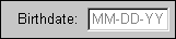
Fig. 11. Date-format masks and labels.
To improve feedback, let users know,
when they make errors, both that there is a problem
and what the solution is. For example, what if the user
types a date in MM-DD-YY format—"12/05/00," say, but
the required format is DD-MM-YY? In this case, the error
message should include the right date format (see Fig.
12).
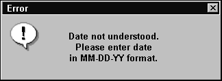
Fig. 12. Error message with the right level of
feedback.
To improve mapping, more closely
match software components to items in the user’s universe.
For example, you can let users enter dates in any format
that makes sense to them, and then change them internally
to the format your application requires. For even better
mapping, you can let users select dates from an onscreen
calendar (Zetie 1995, 210).
Make sure that the mapping is efficient
as well as effective, however. For setting up appointments
in a week or so, a scrollable calendar is fine; for
setting a maturity date 30 years out, a scrollable calendar
would be an abominable waste of time. (You need to be
able to type in a date in that case.) However, in the
financial application, having a calendar as a backup would be useful: If the chosen maturity date fell on
a weekend, a pop-up calendar set to the appropriate
week and year would make it easy to pick a weekday.

Fig. 13. Effective temperature mapping. Users
can drag
the mercury up and down the thermometer.
You also can prevent range errors
with good mapping. A range error occurs if the user
is asked to enter a range of dates, numbers, or other
items, and he or she types an entry for the small end
that is larger than the entry for the large end. Of
course you can test for the error and put up a message,
but why not use a scale instead and thereby prevent
the issue from even coming up? For example, if the only
valid temperatures range between 0° and 100°, let users
pick a temperature by dragging a selector on a 0°-100°
thermometer widget (Fig. 13). Just make sure that you
add an entry area for fine adjustments and for touch
typists.
Constraint
By constraining users with lists, you can prevent "set"
errors—in other words, you can restrict users to a set
of entries known to be valid. For example, you can let
users select one item from a small set of items by using
a combo box, or select more than one item by using a
multiple-select list box. You can also let users enter
anything but validate the entry later against a database
lookup table or a code table (Zetie 1995, 210-212).
For more information about small sets, see Combo Box.
Some applications use keystroke restriction—in other
words, the application validates each character as it
is entered. This method has the advantage of immediate
feedback. However, if the user can’t see the list that
the application is using and she makes a spelling
mistake, which will prevent her from continuing, she
can’t tell what the error is and can’t get out of the
field. To avoid this problem, either make sure the user
can see the relevant part of the list (as per the Microsoft
Windows help indexes) or use keystroke restriction’s
more friendly cousin, auto fill. (See "Auto Fill.")
Recovery strategies
Users learn best by exploring; they will be inclined
to explore if they know that the application will let
them explore without causing unintended damage or that
it will let them correct mistakes easily. One of the
consequences of being able to explore is error—either
user error (typing errors, format errors, and so on)
or exception error (any action that is invalid in the
current system state).
Most field edits are designed to prevent or catch user
errors. However, exception errors are unpredictable
because they are interactions of mode, context, and
whatever has been done so far in the session. Some,
in fact, are not really errors, just unfortunate combinations
of circumstances—for example, the sales clerk cannot
ring up an item because the barcode has no match in
the inventory database. Most exceptions, therefore,
cannot be prevented. The alternative is allowing a graceful
recovery.
Zetie offers three principles that can help the developer
design error-recovery strategies (1995, 222-228):
-
Principle of forgiveness: Make it easy to
reverse unwanted actions. For example, offer multiple
levels of undo and redo. In transaction processing,
do not force users to commit database changes until
absolutely necessary (perhaps by using temporary,
local tables for partial saves and pre-commit saves).
-
Principle of confirmation: Make it hard
to do irreversible damage. The simplest type of
confirmation is the chicken switch: "Are you sure
that you want to blow up the Moon? Yes, No, Cancel."
However, confirmation at the point of closure, although
necessary, doesn’t cover the many possible levels
of destruction. In a multi-user transactional-processing
environment, for example, a mistake can have significant
business costs. If a warehouse supervisor records
a stock delivery, other agents may immediately begin
accepting orders against that stock. If the warehouse
supervisor made a mistake, the company may find
itself with orders it cannot fill. The developer
has to strike a balance between making it difficult
for the user to make a mistake and obstructing correct
actions unnecessarily. The key is the importance
of the mistake (Zetie 1995, 227): How much will
a mistake cost in rework or in actual cash? And
how likely is it to happen?
-
Principle of failsafe: Make the default
or easiest action harmless. Partly this means don’t
make Exit or Delete the default action. (Within
reason: If the user is in a Delete state of mind,
forcing her to reselect the Delete key and do a
confirmation for each file or record is intrusive.
Give her a method for turning off confirmation temporarily.)
But failsafe also requires that work be saved temporarily
somewhere—in automatically created backup files,
in a change-control system, in wastebaskets that
let you undelete files. Make sure that your users
can change their minds.
Auto fill
Auto fill, a type of input transformation, is a good
alternative to the popular but problematic auto skip.
(See the "Auto Skip" section.) With auto fill, the program
fills in the rest of the field as soon as the user has
typed enough characters to match a previous entry for
that field uniquely. For example, Quicken will fill
in "U.S. Post Office" as soon as the user types "U."
The advantage of this approach is that it doesn't slow
down an inexperienced user (Snyder 1997).
To find candidates for auto fill, do some brainstorming.
Test each field for possible "set" behavior. For example,
does this field have a small defined set of entries
(states or provinces)? Does the user have a standard
set of entries that he can enter either all at once
or as he goes along, like the vendors’ list in Quicken?
If the users’ current software has auto-fill fields,
at least make sure that you have the same ones in the
new software. But also look for additional possibilities—for
example, say that the current software fills in the
city and state automatically from the ZIP code. Extend
this functionality by generating a delivery-point bar
code for the address.
When you use auto fill, just make sure that it doesn’t
too tightly restrict users. For example, commercially
available ZIP-code databases occasionally have missing
or wrong ZIP codes. The data-entry clerk has to be able
to override wrong addresses. Work with expert users
to identify typical exceptions and problems.
From an object-oriented point of view, "an autocompletion
text entry field should appear as a subclass of the
generic text entry field." Finding good candidates in
advance and "designing a class hierarchy [for them]
will help insure behavior that is consistent and useful."
(Collins 1995, 278).
Recalculation and "false" values
Number-crunching applications (stock and bond analyses,
accounting applications, spreadsheets) often have a
"recalculation" problem, stated as follows: "As soon
as the user changes one of these numbers (some
crucial benchmark, fee, etc.), all the rest of the numbers
are invalid. How do we prevent him or her from taking
these bad numbers seriously?"
This problem is complicated by timing. In some applications,
the entire set of fields is recalculated automatically
as soon as the user moves to the next field. With automatic
recalculation, most of the difficulty goes away. (The
problem remains if the user’s attention is lost momentarily
or if the recalculation takes a while—she might forget
that the numbers are invalid.)
In other applications, however, the cost of recalculating
automatically is too high. For example, the calculation
might require information from the server or has to
be done on the server, which means network access and
delays. Or perhaps users need to change more than one
number and it doesn’t make sense to recalculate until
they’ve finished the entire set of entries.
The question is, how do you indicate to the user that
a number is invalid or untrue pending a recalculation?
The answer is, offer good feedback. Following are some
of the possibilities. Make sure that you test your choices
on users—an indicator that may seem obvious to you may
be invisible to users.
-
Make the other dependent fields unavailable until
the recalculation is finished. This may be appropriate
when fields are mutually dependent—in other words,
a change in one field must change the other
fields. For example, in a bond-analysis program,
changing the price changes the yield and the spread;
changing the spread changes the price and the yield;
and so on. You can’t change two of the three values
at the same time.
-
Indicate which mutually dependent field is "true"
by changing its background color, font, or the border
of the field. If the user enters a value in another
dependent field, then that field becomes true instead
and its appearance changes.
-
Make the user type the new value or values into
a separate command line (spreadsheet-style) or dialog
box. This has the advantage of indicating that something
out of the ordinary is happening.
-
Change the false values to italic or a different
color until the values are recalculated. This works
for both automatic systems and systems in which
the user must press a Recalculate button. Once the
values have been recalculated, change the color
or font back to normal.
-
If the recalculation itself can take a long time,
disable printing and data exporting (to prevent
dissemination of bad values) during the calculation
but let the user do other work in the meantime.
Also provide him or her with a way to cancel the
recalculation—a progress-indicator box with a Cancel
Calculation button, for example.
When recalculations are instantaneous rather than slow,
you have a different kind of problem. Daniel P.B. Smith
describes it as follows: "What do you do as consecutive
digits are typed into the field? That is, suppose the
old value was 105 and you are typing in the new value,
100. As you type successive digits, the value in the
window is, successively, 105, then 1, then 10, then
100. The calculation itself is virtually instantaneous,
so it is completely feasible to recalculate the successive
results for 1, then 10, then 100. Thus it is easy to
have the display ‘always tell the truth.’ But the resulting
appearance looks and feels weird, and I decided that
was wrong. I decided the right thing to do was to delay
recalcuation until the entry was ‘complete,’ continuing
to display the values for 105 and then changing to the
values for 100. This then compelled me to deal with
the issues of knowing when the entry is complete
(wait for the focus to change), and modifying the appearance
to signify that ‘stale’ values are being displayed."
He added, "I continue to be astonished that such a
familiar problem seems to have no well-accepted standard
convention for its handling" (Smith 1997).
Codes for
paper and online forms
If you need to use codes, keep in mind the following
difficulties (Galitz 1989, 117-119).
On hand-written forms, these letters are often illegible:
Y N V Z Q U G.
On forms and online, these pairs are often confused:
-
I and 1
-
O and 0
-
B and 8
-
Z and 2
These codes are hard to type: YX, JS (vs. TH, IN).
Internationalization of data
Different cultures have different calendars, different
ways of presenting dates and times, different ways of
indicating currency, different weights and measures,
and different requirements for control characters.
The next few sections contain information about various
data formats. However, these tables are designed to
show the range of variations rather than every possible
format. You might want to consult an experienced translator
during the design phase for any exceptions or recent
changes to the target-language standards. Note: The
"See Also" section contains a list of internationalization
resources.
Calendars
Some of the calendar systems used in different countries
or industries are listed on Table 1.
Table
1. International Calendar Systems |
Civil
or Business |
Arabic
astronomical lunar calendar |
A
lunar calendar beginning on the first day of the
month preceding Mohammed's journey from Mecca
to Medina (July 16, 622 Gregorian); it measures
the Era of the Hegira. |
Arabic
civil lunar calendar |
A
lunar calendar that retains the traditional method
of calculating exact lunations for the user's
location (Apple Computer 1992, 226). |
Buddhist
calendar |
Countries
using Buddhist calendars specify their year as
the Buddhist era, which varies from country to
country, as does the recognized birthdate of the
Buddha (National Language Technical Center 1992,
4-1). |
Hebrew
calendar |
A
solar and lunar calendar that measures time from
the traditional date of creation, which can be
extrapolated to October 6, 3761 B.C. on the Gregorian
calendar. A year can be 353 to 355 days long or
383 to 385 days long (Apple Computer 1992, 227). |
Japanese
imperial calendar |
The
same as the Gregorian calendar except that its
year number is based on the year of accession
of the current emperor. Since each emperor gives
a name to his reign, the dates also include the
name of the reign (Apple Computer 1992, 228). |
Gregorian
calendar |
A
solar calendar that measures time since the date
accepted as the birth date of Jesus Christ. Used
as the civil calendar in English-speaking and
Western European countries and as a business calendar
worldwide. |
Professional |
Julian day |
Astronomical
day count. January 1, 1987, is Julian day 2,446,795.5,
for example (National Language Technical Center
1991, 3-2). |
Day number reference |
YYDDD
format. January 1, 2000, is 00001 (National Language
Technical Center 1991, 3-2). |
Many of these calendars, or algorithms that can be
used to switch from one to another, are supplied with
localized versions of operating-system software.
Date formats
The short-date formats are methods
for writing the day, month, and year in numbers and
symbols. (In long-date formats, the date is spelled
out ¾ December 5, 1998, for
example.)
Date formats vary between
different calendar systems as well as between countries
and regions. Table 2 lists some short-date samples using
December 5, 1998 as the date.
Table
2. International Date Formats |
Country |
Format |
Sample |
Bulgaria |
yyyy-mm-dd
(months use roman numerals) |
1998-XII-05 |
Canada, English |
dd/mm/yy |
05/12/98 |
Canada, French |
yy-mm-dd |
98-12-05 |
France |
dd/mm/yyyy or dd.mm.yyyy |
05/12/1998 or 05.12.1998 |
Germany |
dd.mm.yyyy |
5.12.1998 |
Japan, civil |
yyyy.mm.dd |
1998.12.05 |
Japan, imperial |
era yy year mm month dd day |
must be written in
Kanji characters |
U.S. |
mm/dd/yy |
12/05/98 |
Note: Some multinational organizations use long-date
formats exclusively to prevent misunderstandings.
Time
Ways of presenting time of day also vary, although
not as often as dates. Table 3 gives some examples (National
Language Technical Center 1992, 4-8-4-9).
Note: In military or 24-hour time, midnight
is "00:00:00," not "24:00:00." Midnight is also not
12:00 a.m. and noon is not 12:00 p.m. (it's 12 noon
or 12:00 in 24-hour time).
Table
3. International Time Formats |
Country |
Format |
Sample |
Canada, English |
hh:mm:ss |
22:49:11 |
Canada, French |
hh h mm min ss s |
22 h 49 min 11 s |
Sweden |
kl hh.mm.ss |
kl 22.49.11 |
U.S. |
hh:mm:ss a.m. or p.m. |
10:49 p.m. or 10:49:11 |
Money
Currency has these characteristics::
-
The symbol used to indicate
the currency¾ for example, £ for British pound,
¥ for Japanese yen
-
Where the symbol appears in
the number
-
The formats of the monetary
fields themselves
-
How negative numbers are shown
(see "Mathematical formats")
-
Field sizes
Table 4 lists some
examples of monetary formats (National Language Technical
Center 1991, 3-6).
Table
4. International Currency Formats |
Example |
Country and Currency
Name |
$12,345.67 |
U.S.
dollar |
DM12.345,67 |
German
mark |
12
345,67 F |
French
franc |
N$
123,45- |
Uruguayan
nuevo peso, negative |
123$45 |
Portuguese
escudo |
Note: ISO 4217, Codes
for the Representation of Currency and Funds, is
a list of unambiguous, uppercase, three-letter codes
for all national currencies. Although many countries
call their currency "dollars," the ISO codes differentiate
among them well: For example, the code for the U.S.
dollar is USD, the code for the Canadian dollar is CAD,
and code for the New Zealand dollar is NZD. For lists
of international currencies (in a currency commodities
application, for example), using these codes may be
easier and less ambiguous than trying to use the national
symbols.
Although localized operating-systems
accommodate different currencies, you must remember
to leave enough space in your fields. Some currencies
use numbers that are up to four digits larger than what
you'd need to express the same amount in U.S. dollars.
For example, the equivalent of $10,000 is approximately
16,850,000 Italian lira.
If the country uses brackets to
indicate negative numbers, you must add another two
characters, plus up to four more characters for the
currency symbol, and two characters for delimiters (National
Language Technical Center 1991, 3-6).
The international financial markets
have their own peculiar formats for prices. Prices are
often quoted in eights, sixteenths, and thirty-seconds,
which may be displayed as fractions (981/8),
decimal numbers, or with hyphens and pluses to indicate
various combinations of eighths, sixteenths, and thirty-seconds
(98-15+).
Mathematical formats
Although mathematics is an international
language, it does have dialects. Here are some areas
of difference:
Negative numbers
You may find a leading hyphen -10,
a trailing hyphen 10-,
parentheses (10),
or square brackets [10] being used to indicate negative numbers. Remember to
align numbers correctly:
123
456 789
[234 567 890] ¬ out of alignment
Names for large numbers
In the U.S., this amount¾ 1,000,000,000¾ is a billion. In the U.K. (and Europe generally), this
same amount is called a "thousand million" or a "milliard."
A British billion is the same as the U.S. trillion¾ 1,000,000,000,000. This difference is beginning to be
erased in financial applications. (The international
community is settling on the U.S. format.) However,
if there is any possibility of error, make sure that
you know what terminology your users are using.
Separators for decimals and thousands
Table 5 lists some common variations
in decimal and thousands separators (National Language
Technical Center 1991, 3-6; National Language Technical
Center 1991, 5-3-5-4; Apple Computer 1992, 200; Microsoft
1993, 217-228).
Table
5. International Mathematical Formats |
Convention |
Decimal |
4 Digits Plus
Decimal |
More than 4 Digits |
Used in |
Comma,
period |
.123 |
1,234.56 |
12,345,678.90 |
U.S.,
English-speaking Canada |
Apostrophe,
period |
.123 |
1'234.56 |
12'345'678.90 |
Switzerland |
Space,
period |
.123 |
1
234.56 |
12
345 678.90 |
Greece |
Space,
comma |
0,123 |
1234,56 |
12
345 678,90 |
French-speaking
Canada, France, South Africa |
Period,
comma |
0,123 |
1.234,56 |
12.345.678,90 |
Poland,
Iceland, Brazil |
Rounding conventions. Rounding conventions vary not only from one country
to another but from one industry to another, and sometimes
within industries according to convention.
In Switzerland, for example, legislation
governs the rounding of monetary values. Instead of
rounding up by 0.01, Swiss francs round up or down by
0.05. For example, according to the National Language
Technical Center (1992, 5-2),
12.325 rounds down to 12.30
12.326 rounds up to 12.35
12.376 rounds up to 12.40
Another example: In the U.S. bond market,
prices of primary-market Treasuries ("primary" means
sold by the Federal government to brokers) are rounded
to three decimal places, but secondary-market Treasury
prices (from brokers to portfolio managers and other
buyers) are rounded to six decimal places. Corporate,
government agency, and municipal securities are truncated
at three decimal places.
Weights and measures
Most countries use metric systems rather
than the imperial system used in the U.S. and the U.K.
Therefore, enabling weights and measures usually means
accommodating metric weights, measures, and unit names
or symbols. It may, however, include transforming numbers
from one system to another in countries like the U.S.
and Canada that use both metric and imperial measurement
systems.
Also, some industries have their own
systems. For example, U.S. land surveyors and engineers
use an imperial foot divided into 10 rather than 12
segments. Paper manufacturers measure their paper by
caliper thickness and weight. Font manufacturers use
points, picas, and agates. Jewelers use carats. Some
of these systems are local; others, to facilitate trade,
are international.
Usability tests:
When you use auto fill, make sure that
it doesn’t restrict users. Users have to be able to
override wrong information or add missing information.
Work with expert users to identify typical exceptions
and problems.
If the application will be internationalized
(users can pick their own calendars, currencies, and
so on, but most of the interface will be in English)
or localized (all of the interface will be translated),
do extensive testing with target users in the other
locations.
See also:
Command Line; Field,
Protected; Field,
Required.
Internationalization resources
For an overview on the internationalization
of GUIs, see Fowler and Stanwick, The GUI Style Guide (1995). For help with internationalization programming,
see Nadine Kano, Developing International Software
for Windows 95 and Windows NT (1995), Ken
Lunde, Understanding Japanese Information Processing (1993), the National Language Technical Center
(IBM) National Language Support Reference Manual, Vol. 2 (1992), Bill Tuthill, Solaris international
developer’s guide (1993), Apple Computer Guide
to Macintosh Software Localization (1992).
As well as programming structures and
hints, these books also contain information on sorting
orders, cultural differences, differences in calendars,
money, weights and measures, and so on, from one country
to another. If you’re serious about internationalization,
it is worth your while to get them all, whether they
match your development platform or not.

Field,
Protected
An area that displays data but that
doesn’t accept a cursor. Use protected fields to show
system values, already saved values, or calculated values
without allowing changes.
Good for:
Displaying read-only results of calculations
or earlier entries (Fig. 15).

Fig. 14. Permanently protected field.
Indicating and managing business and
data-integrity rules (Fig. 15).
Design guidelines:
Note that data-entry, required, and
protected fields overlap. Required fields are a type
of data-entry field, and protected fields can change
from protected to entry, depending on which business
or data-integrity rules are in effect.
There are two types of protected fields—text-entry
fields that are changed dynamically between protected
and unprotected modes to fulfill business rules; and
read-only fields. Read-only fields can be changed dynamically
as well to reflect changes in states. For example, you
can use a read-only field to display the current directory
path or the current date and time (Microsoft 1995, 162).
You can create read-only fields using
a text label (if you can change labels dynamically)
or a field set to not accept user input (false for user
input).
Visual design for protected fields
To indicate a read-only field:
- don’t put an entry-area box around
the text in a read-only field (Fig. 14)
- set the background color to the window’s
background (the client area)
To indicate that an entry field has
switched to protected, either:
- change the text to gray (Fig. 15)
and continue to show the entry-area box (the bounding
box)
- change the entry area to the background
color (but maintain the bounding box). In Windows
95, the system itself changes the background color
of the field to indicate the change (Microsoft 1995,
158).
Functional guidelines
Don’t confuse the user:
- Don’t let users select protected
information if they can’t copy or change it. (However,
if they can copy protected information and you want them to be able to copy it, making it selectable
is fine.)
- Make sure that read-only data really
has to be read-only. For example, if a Windows 95
icon label is editable on the desktop, it should also
be editable in the Properties box.
View-only vs. data-entry windows
Confusions sometimes occur because designers
have used the data-entry window as the view window—the
layout and the fields are the same, but suddenly the
user can’t change any of the information.
Rather than trying to fix this problem
in the documentation or training, try making separate
versions of the window. Input and view are often such
different modes that they require different layouts.
For example, data-entry windows must match the entry
form or script, while view windows should organize the
data according to the user’s interest in the information.
See Window for information about the three types of
windows.
On the other hand, you may want to rethink
the divisions between inquire and update—a rigid differentiation
may not actually be necessary in windowing systems.
Business rules
Field protection is often used to enforce
business rules such as "Only managers can approve a
draw against a new account." Make sure that you capture
the business-rule information in the requirements phase.
Usability tests:
Make sure that the customer really needs
to protect the data. This information should have been
captured in the requirements phase, but it’s always
good to check again.
Also, when you do usability testing,
listen for questions that indicate that the users are
lost: "Why can’t I change this?"
See also:
Field, Entry; Field, Required.
Field,
Required
An entry area that requires users to
enter valid data.
Good for:
For databases, making sure that records
contain complete or necessary information (Fig. 16).
For analyses, making sure that the entries
are complete and probably valid.
Design guidelines:
Note that data-entry, required, and
protected fields overlap. Required fields are a type
of data-entry field, and protected fields can change
from protected to entry, depending on which business
or data-integrity rules are in effect.
How to indicate a required
field
Feedback for required fields has three
aspects:
- Look—how are required fields distinguished
from normal fields?
- Timing—when are required fields distinguished
from normal fields?
- Behavior—what happens when required
fields are not filled in?
The type of feedback you use depends
on the user profile. If the users are mostly inexperienced
(either because they use the application only occasionally
or there is high turnover), then you want feedback to
be obvious and immediate (within reason). If the users
are experienced, then your feedback can be more subtle
and unobtrusive. Use Table 6, Table 7, and Table 8 to
pick the appropriate type of feedback for your user
profile. The tables are organized from most to least
obtrusive. (For more background, see Zetie, 1995, chapter
6, "Errors and Help.")
Table
6. Look of a Required Field |
Type of Visual
Distinction |
Effect on Inexperienced
Users |
Effect on Experienced
Users |
Change
background color of field. |
Strong
cue. |
Probably
distracting. |
Add
"Required," an abbreviation (R or Req’d), or a
symbol (Ö , , è , for example) to the label. |
Medium-level
cue; easy to learn. |
Not
distracting, although the symbols may add clutter. |
Change
the color of the field text. |
Invisible
until the user starts to type. |
Less
distracting. |
Change
the color of the label. |
Less
obvious than changing the background of the field. |
Less
distracting. |
Change
the label font size or style (bold for required,
medium for normal). |
Changing
type sizes or styles may be too subtle. |
Too
many fonts looks messy. |
Change
pointer when over required field. |
No
cue is visible when pointer isn’t over field. |
Less
distracting. |
Don’t
distinguish at all—instead, identify the required
mode in status-line hints or tooltips. |
Not
much help for novices. |
Use
if any option is too distracting for experienced
users. |
Don’t
distinguish—however, put all required fields at
the top of the window. |
If
the fields are at the top, the user is naturally
inclined to fill them in. |
Not
distracting. However, putting all required fields
in one place may break up logical groupings or
a natural order. |
Once you’ve decided on a visual cue,
follow up with a behavioral cue. See Table 7.
Table
7. Behavior of a Required Field |
Behavior Type |
Advantages |
Disadvantages |
Forbid
field exit until user enters value. |
Instant
feedback. |
Very
constraining—user may never get out of the field
if she doesn’t know what caused the error. |
Forbid
field exit but show explanation. |
Explicit
explanation is good. |
Very
modal and irritating to experienced users. |
Disable
the OK, Save, or Apply button until all required
fields are filled. |
Good
for simple cases (for example, when a Logon button
is disabled until user enters a password). |
Bad
when user can’t deduce which combinations of fields are required. |
Show
alert when user selects enabled OK, Save, or Apply
button: User gets an error message saying that
highlighted fields must be filled in, and the
required fields change color (or otherwise show
themselves). |
Strong
feedback plus offers an explicit explanation for
novices without distracting experienced users. |
Not
as obvious as enabling the button when all of
the required fields are filled. |
When you notify
users—before they enter the field, when they are in
the field, or when they leave the field—is as important
as how you notify them. Make sure that you match
the feedback levels for look, timing, and behavior.
See Table 8.
Table
8. Timing of Notification |
Timing Method |
Effect on Inexperienced
Users |
Effect on Experienced
Users |
Notes |
Always
distinguish required fields. |
Helpful. |
Distracting. |
Creates
a stable display. |
Distinguish
on demand. |
Must
be documented; otherwise, users will never know
about it. |
Offers
control. |
Give
the user a keyboard shortcut, preference-style
setting, or a View menu option that turns the
distinction on and off. Preference should be saved
between sessions. |
Distinguish
only when validation fails. |
Little
feedback. |
Unobtrusive. |
Required
fields are marked only when the user tries to
leave the field or the dialog box. |
Defaults and required fields
If you are going to make a field mandatory,
then add a default entry. Make sure that this default
is automatically selected as soon as the user enters
the field, so that it can be easily replaced if necessary.
Whenever possible, consider replacing
required fields with combo boxes or drop-down list boxes.
Help for required fields
Add tooltips to your required fields;
if you can’t add tooltips, at least add a status-bar
hint that says something like "Required" or "You must
enter data in this field."
Provide field-level help to the required
fields. See Online Help, Context-Sensitive, for details.
If you use error messages for required
fields, add a help button or Details button to the message
box. Put "Required" as the first word in the tooltip
and online help panel. Offer business-rule help as well
as formatting help (if necessary). Also have the cursor
return to the required field when the error message
appears. Do not delete the erroneous text, if possible.
Instead, let the user modify it.
Usability tests:
Do not over-constrain. When testing
prototypes, watch for and ask about signs of frustration.
Make sure that users can get all the
information needed to fill in the required fields (perhaps
on other windows) or, if they cannot, that they can
save an unfinished window. Although much of the constraint
information (logical or because of business rules) should
be in your task analysis, subtleties may appear in the
test phases.
See also:
Combo Box; Drop-Down List; Field,
Entry; Field, Protected.
|
