|
You are here: Home ~ Desktop UIs ~ Graph - Iconic Label
Graph
A graphical method for displaying numeric
and quantitative information.
Good for:
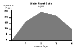
Quickly showing relationships among
data points (Fig. 1).
Not good for:
Showing details like the data points
themselves.
Design guidelines:
Following are the most common types
of graphs. Make sure that you select the right graph
type for the data and that your format is correct. For
example, many applications mistakenly use an area-chart
format for line charts or a histogram format for bar
charts. (For more information, see Fowler and Stanwick,
1995, chapter 7, "Charts and Graphs.")
Changes over Time
Bar |
|
Other names: Column
|
Good for comparing
or ranking a small number of values (no more
than 10 or 12).
Also useful when the data sets are so similar
that they would overlap if shown as lines. By
using a bar chart, you can visually separate the
data sets.
The spacing between bars or sets of bars should
be 1/2 the size of the bars.
Variations:
Clustered bar, zero-line |
Line |
|
Other names: Time
series
|
Good for comparing
one set of values to another. Also good for displaying trends.
Line graphs show interpolated points and slopes
well.
Variations:
In finance, high/low/close (in commodities field,
also called "bar"); candle charts. |
Statistics
Frequency polygon |
|
Other names: Bell
curve, mistakenly—bell curves are smoothed normal
distributions.
|
Good for showing
counts—how many times something happened or
how many times a number appeared. Shows frequency
distributions (the count for each interval during
which data were collected) as smoothed curves.
Variations:
See Histogram. |
Histogram |
|
Other names: Step
|
Good for comparing
counts.
Shows frequency distributions as steps or bars.
Good when values fall into discrete sets and
not good when they don't.
Note: Histogram bars always touch. Bars
(or sets of bars) on bar charts do not touch.
Variations:
Pyramid histogram |
Scatterplot |
|
Other names: Scattergram, XY scatter
|
Good for spotting
clusters or out-of-range points. Each data
point is the intersection of two variables plotted
against the two axes.
Variations:
Bubble chart |
Proportion
Area |
|
Other names: Surface, component part, belt, mountain
|
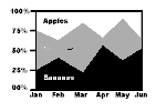
Good for showing cumulative totals over time. Each data set
is added to the data set below it, so that the
top edge of the top set is the sum of the data
at any point on the timeline.
Totals can be numbers or percentages. |
Pie |
|
Other names: Circle, cake, sector
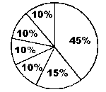
|
Good for showing snapshots of proportional relationships,
one snapshot per period of time. One pie is one
whole (100 percent).
Bad for comparing two or more relationships.
Most people find it hard to compare wedge-shaped
areas from one pie chart to the next. |
Segmented bar |
|
Other names: Stacked bar chart, sliding multi-component bar
chart, population pyramid, butterfly chart, subdivided
bar chart
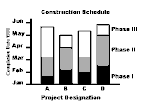
|
Good for showing proportional relationships (like pie charts) over time (like bar charts).
Use to compare parts of a whole¾ for example,
how interest and principal equal total savings.
Do not include parts and the whole in the same
bar. For example, don't stack interest, principal,
and total savings on the same bar. The bar will
be twice the height it should be.
Variations:
Paired horizontal bar chart (deviation bar chart) |
Color on graphs
Eight percent of men—one in twelve—have
red-green color blindness. In other words, if you have
24 men in your office, two will have trouble separating
red from green, either when the colors are next to one
another or when the lights are dim. (Note that most
individuals with color blindness see all colors of the
spectrum, but simply can’t tell the difference between
two of them. For this reason, "color confusion" has
replaced "color blindness" as the term of choice.)
What does this mean to your GUI? It
means that using red and green lines as the default
colors in your graphs, for example, is a bad idea. Every
twelfth male user won’t have a clue as to what the graph
says. Using red and green borders to indicate which
window has focus, as Motif does, is also a bad idea.
Another bad idea is using red lettering on a black,
brown, or green background, since all of these colors
may blend into one another for users with color confusions.
However, say that you never use red
and green in your graphs because, well, you don’t like
green. Instead, you use blue and orange, or red and
blue.
It doesn’t matter which colors you pick.
Everyone without a color printer might as well be color-blind
when he or she prints out that graph.
The solution
There are a variety of solutions to
this problem. However, the bottom line is this: Use
color as a secondary, not a primary, signal.
Use color to quickly show correlations
between things (for example, all required fields have
a blue border) or to indicate changes. For example,
you could have a temperature gauge on which a virtual
mercury bar changes color as the temperature gets higher.
The height of the mercury would be the primary cue.
The change in color would be the secondary cue.
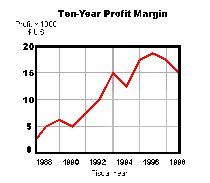
Following this rule, then, you could
revise a line graph as shown in Fig. 2: One solid line,
one broken line. (Remember that black and white are
colors too—on a white background, a black line has more
contrast than any color and vice versa.)
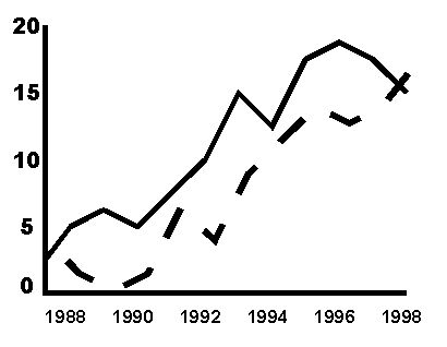
Fig. 2. The right way to do a line chart. You can fix clusters of bars on bar
charts by using various hatching and fill patterns.
However, the results can become very busy (see Fig.
3, "Poor").
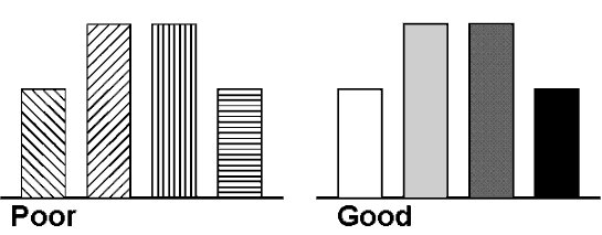
Fig.
3. The wrong and right ways to do a bar chart.
For a two-bar chart, the best solution
is one solid black bar (or white bar, depending on the
background color), and one empty bar. For charts with
more than two clustered bars, use shades of gray (Fig.
3, "Good"). You can either use shades of gray or you
can use colors with appropriate grayscale values. Every
color has a grayscale value (its "darkness," so to speak)
as well as a hue (the "redness" of red). If you use
colors separated by 20 percent differences in grayscale,
everyone will be able to tell the bars apart.
The best way to check for grayscale
is to create a grayscale chart, and then put your colors
on the chart and compare them to the grays in low light
or by squinting. If you’ve matched your color to the
grayscale chart accurately, the color seems to fade
into the gray. For a very low-tech approach, simply
pick a few likely colors, fill in your bars, and squint.
If the colors stay separate, then you’ve picked the
right colors.
How to create a gray-scale chart
1. Pick a program with a color or
palette editor. Open the editor and either find or create
a set of nine grays and one black separated by 10 percent
differences in darkness. Use white for the background.
The values for each gray are:
Gray |
RGB Values |
HSV Values |
HEX
Value |
10% |
229, 229, 229 |
0, 0%, 10% |
E5E5E5 |
20% |
204, 204, 204 |
0, 0%, 20% |
CCCCCC |
30% |
178, 178, 178 |
0, 0%, 30% |
B2B2B2 |
40% |
153, 153, 153 |
0, 0%, 40% |
999999 |
50% |
127, 127, 127 |
0, 0%, 50% |
7F7F7F |
60% |
102, 102, 102 |
0, 0%, 60% |
666666 |
70% |
76, 76, 76 |
0, 0%, 70% |
4C4C4C |
80% |
51, 51, 51 |
0, 0%, 80% |
333333 |
90% |
25, 25, 25 |
0, 0%, 90% |
191919 |
100% (black) |
0, 0, 0 |
0, 0%, 100% |
000000 |
2. Draw a set of gray boxes on a
white background, one color of gray per box, ranging
from 10 percent to 100 percent (black).
3. Draw diamonds of all the colors
you want to test.
4. Drag each color sample over the
chart, squinting as you drag it. When the color and
a gray box seem to match, you've found its gray-scale
value.
5. Save the colors that are either
20 or 30 percent apart (separated by two or three boxes)
and discard the rest.
Note: Some colors, because of their
brightness, maintain high contrast no matter where you
put them on the grayscale. However, check the size.
Small areas of yellow disappear against white. Red,
if used for small dots or thin lines, shrinks away to
nothing against a dark background. At the other end
of the spectrum, avoid thin blue lines and text. Because
of the structure of the eye and blue’s wavelength, it
is hard to focus on small blue objects.
Show underlying data points
Make sure that users can access the
underlying data. Here are a few methods:
- Let users switch
between tabular and graph views with a pushbutton
or tabbed dialog boxes (Fig. 4).
 Fig. 4. Add a table/graph pushbutton.
- Let users toggle data points on and
off with a check box (Fig. 5).
 Fig. 5. Toggle data points with a check box.
- If the user clicks on a data point or
bar, show the underlying value (Fig. 6).
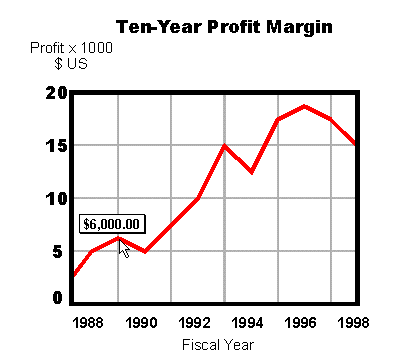
Fig. 6. Show the value when the user clicks the
data point.
Recommendations for titles
For marketing or sales-oriented graph
applications, find a way to let users put a message
or point of view in the title—let them emphasize the
point of the data. For example, "Company Sales Trend"
doesn't say as much as "Company Sales Up in Northwest"
or "Sales Down in Southeast." Provide a default title
that users can overwrite if they want.
Recommendations for labels
State the units of measurement. Include the units in the X and Y axis labels. For example,
if the dependent variables are percentages, include
"Percent" or "%" in the Y-axis label.
Don't stack letters vertically. When
the left margin is too narrow for the Y-axis label,
the label should appear above the margin. If you cannot
put the label there, don't stack the letters like this:
L
a
b
e
l
Most people read by recognizing the
entire shape of the word, not individual letters. When
you stack the label, you force the reader to puzzle
out the word from the letters. You can, however, turn
the label sideways without causing as much of a readability
problem.
Make labels clear. Spell out
all words. If space is very tight, abbreviate using
only standard abbreviations or symbols. Check an abbreviation
dictionary.
Try to avoid keys (legends) whenever
possible. Instead, put explanations on the bars,
lines, or data points themselves. For example, rather
than creating a key to explain what a set of bars means,
label the bars directly by adding numbers to the data
points or to the tops of bars.
If you do use a key, try to put it inside
the graph panel, in a spot where there are no data.
If you put it outside the panel, the eye is drawn away
from the data. Do not box the key because then the box
draws attention to itself.
Usability tests:
Obviousness: Are the goals of the graph apparent? For example, if
the graph is supposed to highlight out-of-range data
points, can users spot them immediately? Is the title
too generic—can the users recognize the use or contents
of the graph from the title?
Affordances: Do the users recognize
the graph type and, if so, does it help them understand
the data more easily?
Heuristics: Do experts agree
that you’ve formatted the data correctly? Check with
people with expertise in statistics and mathematics.
Many industries and business domains
have specialized types of graphs. As well as developing
lists of subject-matter expert reviewers, it might help
to collect standard reference works, even textbooks,
in the domain for which you’re developing graphs. Expect
expert users such as stockbrokers and doctors to be
visually literate and to prefer windows full of complex
graphs and charts.
In addition, different cultures have
different levels of visual literacy. Unlike mass-audience
U.S. readers, for example, Japanese readers expect and
can understand highly complex pictures, charts, and
graphs (Kohl et al. 1993, 63-73). If you expect to internationalize
your applications, check all graphical and data-analysis
requirements with your international experts and marketing
departments.
Mechanical: Users often prefer
to see preformatted graphs as their first experience
with a graph program. Later, if they need to, they can
fine-tune the display. Have you made it easy for the
user to get an interesting graph the first time he or
she uses the application (perhaps with a wizard, if
the display or data are complex)?
See also:
Table.
For examples of successful and failed
charts, graphs, and tables from a variety of businesses
and situations, see Edward Tufte’s Envisioning Information (1990) and Visual Display of Quantitative Information (1983).
To avoid stepping into one of graphing’s
many pitfalls, see Darrell Huff’s How to Lie with
Statistics (1954), a slender book now (for good
reason) in its fortieth edition.
Gene Zelazny’s Say It With Charts:
The Executive's Guide to Successful Presentations in
the 1990s, is designed for people doing business
presentations. The book explains what all of the major
chart types are, how to use the various types correctly,
and how to make them easy to read. Zelazny then goes
a step further, and shows you how to create sophisticated
and elegant charts from the basics.

Icon,
Desktop
A picture used to indicate and start
an application or an object (printer, wastebasket).
Good for:
Starting an application (Fig. 7).
Using an interface object, such as printing
a document by dragging it to a printer icon (Fig. 8).
Design guidelines:
The desktop icon not only identifies
your application but it has a marketing and corporate
identification function as well. A successful icon:
- Looks different from all other unrelated
icons on the desktop.
- Resembles your corporate logo (or
at least uses the same colors, shapes, and typefaces).
- Gives the users some idea of what
it does or represents. For example, a word processing
program's icon might include a pen, an accounting
program might show a ledger, and so on.
- Is recognizable when it is no larger
than 16 pixels square.
- Looks as good in black and white
as it does in color.
Because desktop icons are a very important
part of your company’s corporate identity, make sure
that the same professional artists and designers who
designed your logo also design your icon (or oversee
its design). This is not a job for amateurs.
Usability tests:
A desktop icon must be discriminable
from all other desktop icons and should, if possible,
indicate the type of software it represents (network
tools, word processor, etc.). Use a paper-and-pencil
matching test.
See also:
Iconic Label.
Iconic
Label
A pictorial description of a tool or
function that generally appears on toolbars and palettes.
Good for:
Identifying tools that require a mouse
or pen to be effective. Drawing tools—paintbrushes,
erasers, and so on—are typical examples (Fig. 9).
Identifying mouse shortcuts—for example,
Save, Cut, Copy, Paste. Use standard images for these
types of options (Fig. 10).
Not good for:
- Abstract functions for which it is
difficult to find visual metaphors (for example, Sort).
Use text labels instead.
- Functions that do not require or
benefit from mouse use.
Design guidelines:
Most development packages contain sets
of iconic labels that you can use for free. Take advantage
of the most popular ones: Save, Cut, Copy, Paste, New,
Open. However, other icons may not be very recognizable
or standard. If you use these less well-known icons,
make sure that they have tooltips and that you test
them for comprehensibility. (See "Usability Tests" below.)
Official sizes
The Windows 95 style guide suggests
that you let users toggle the sizes of the toolbar buttons.
These are the suggested sizes:
- 24x22 pixels and 32x30 pixels for
the buttons themselves
- 16x16 and 24x24 pixels for the picture
labels
The guide also contains a list of all
Microsoft’s common toolbar images and the official names
of their functions (Microsoft 1995, 176-178). Other
platforms have similar suggested icon sizes and uses;
most development kits come with a basic set of iconic
toolbar buttons. Reuse whatever you can.
What really works
Mullet and Sano (1995, 201-202) report
that the toolbar icons described as most useful typically
correspond to either concrete attributes of visible
objects (font attributes, paragraph alignments, etc.)
or to concrete system objects (printers and folders).
They add that it is difficult to develop
visual representations that distinguish between similar
functions (Save and Save As) or between controls that
should probably look similar but have different behaviors
(print a document, fax a document).
As visual designers, they argue for
putting abstract commands and activities on menus, where
you can use words to describe them, and putting only
concrete settings and tools on toolbars and palettes.
This is the ideal solution. However,
most development companies don’t live in the ideal world
but rather in the trade-off world. Although an idealist
might find this solution messy, human-factors research
indicates that buttons with both pictures and text labels
are the best solution. See "Usability Tests" below.
How to design an iconic label
The first rule of icon design: Start designing on paper, not on the computer.
Sketching on paper is faster. It’s also easier to throw
away the bad ideas when they’re only on napkins and
scrap paper.
Following are some hints for finding
and developing the right images.
Show the object (when you can)
Showing the object is probably the most
direct way of communicating an idea. For example, to
represent the idea of printing a file, make an icon
of a printer. Or to represent deleting a file, show
a garbage can or wastebasket.
If necessary, turn verbs into nouns.
It is much easier to represent an object (a noun) than
it is to represent an action (a verb) through pictures.
For instance, rather than trying to represent the action of printing a document, it is much easier to show the printer.
Use a visual analogy
If you can't show the object itself,
try to use a visual analogy.
Metaphor
Have an image stand in for an idea. For
instance, say that you need an icon for a maintenance
program. To condense a complex idea into a simple image,
use a picture of a maintenance tool¾ a wrench, for example (Fig. 11).
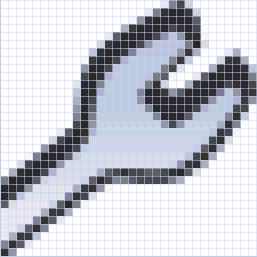
Fig. 11. Possible maintenance icon.
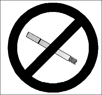
Litotes
A litotes (pronounced LIE-ta-tees) is
a way of describing something by stating the negative
of its opposite. For example, when you say "not bad"
for "good," you’re using a verbal litotes. A picture
of a broken chain could be a visual litotes representing
"freedom." Any image inside a circle with a slash through
it is a litotes (Fig. 12).
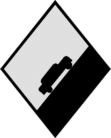
Synecdoche
A synecdoche (pronounced si-NEK-da-kee)
is a metaphor in which a part represents the whole.
For example, a chili pepper could represent a Mexican
restaurant (Fig. 13), the Golden Gate bridge could represent
San Francisco, or the Eiffel Tower could represent Paris.
Hyperbole
Hyperbole uses exaggeration to convey
an idea. For example, you could use a bomb to represent
danger, a bulging garbage can to represent a thrown-away
file, or a remarkably steep incline to represent a hill
(Fig. 14).
Make sure that a thread runs through the buttons
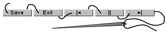
Fig. 15. A thread runs through a successful toolbar's
buttons.
When you're designing the pictures for
toolbar buttons, simplify the process by finding a theme
for the buttons (Fig. 15):
Give the buttons an intellectual
theme. For example, for a recipe program, "sort"
could be represented by a sieve; for a banking program,
it could be represented by a coin dispenser.
For models of good thematic design,
look at the symbol sets developed for the Olympic Games
and the symbols developed by Xerox Corporation for copier
and office equipment.
Give the buttons a visual theme¾ for example, use only geometric
shapes or only rounded shapes, or use a common color
palette. Macintosh buttons use similar colors by default,
since only 34 colors of the entire 256 color palette
are available in ResEdit. Microsoft Windows 3.x provides
only 16 colors.
Reuse existing symbols
Many industries have their own iconographies¾ electricians have symbols for transistors and electrical
lines, telecommunications workers have symbols for central
offices and the public network (a cloud), network engineers
have symbols for nodes, WANs, LANs, and so on. In the
U.S., the American National Standards Institute publishes
and/or redistributes national and international standards,
including symbol sets. The symbol sets include everything
from agricultural equipment and aircraft systems to
electrical and mechanical systems to warning signs.
Helpful hint: Use old-fashioned images.
Traditional, simpler, images sometimes work better than
new ones. For example, a skeleton key—not a modern button
lock, for example—is often used to represent locked
or safeguarded information on Web sites. In the U.S.,
the most common image used for electronic mail is the
rural mailbox, which is widely recognizable even though
it is seldom seen in the cities where most users live
(Horton 1994, 46-47).
If all else fails, find idiomatic images
Alan Cooper in About Face (1995) suggests that humans can learn and
remember idioms ("beat around the bush" or "cool") very
easily without relying on comparisons to known situations.
Many idioms have no metaphoric meaning at all, he points
out; the stories behind others were lost ages ago.
Although idioms must be learned, Cooper
says, good ones only need to be learned once. It is
quite easy to learn idioms like "politically correct"
or "the lights are on but nobody’s home" after a single
hearing. It is also easy to learn how a scrollbar or
a resize button works, he says, and as neither exists
in the real world, they are clearly not metaphoric.
They are idiomatic.
How do you create an idiom, then? Branding—marketing—advertising,
he suggests. "Synthesizing idioms is the essence of
product branding, whereby a company takes a product
or company name and imbues it with a desired meaning.
Tylenol is, by itself, a meaningless word, an idiom,
but the McNeil company has spent millions to make you
associate that word with safe, simple, trustworthy pain
relief" (Cooper 1995, 59-60).
In terms of a user interface, then,
an idiom is any image or action that is striking enough
to learn quickly and that has a reasonable affordance.
(A scrollbar that closed documents, for example, wouldn’t
make sense and would therefore be hard to learn.)
At the end, simplify the design
Once you have an icon or set of icons
that everyone likes, simplify it (Fig. 16). See how
many elements (colors, lines, shapes) you can remove
without "breaking" the icon.
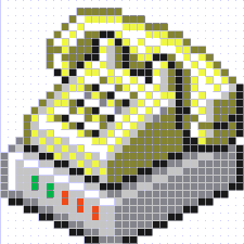 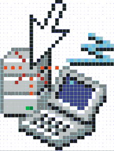
Fig. 16. A
good design, and a too fancy design.
Usability tests:
The issues in testing iconic labels
are:
- Whether users understand the meanings
of the pictures immediately (ease of learning)
- Whether they remember the meanings
readily, once learned (memorability)
- Whether users can discriminate between
similar pictograms or similar ideas
- How long it takes them to become
proficient and whether they graduate to doing complex
or sophisticated tasks (Horton 1994, 302)
Ease of learning is especially important
when you’re writing for casual or inexperienced users.
Test using a paper and pencil matching test.
Memorability is most important when
you’re writing for experienced users. If your user group
will use the product daily, you can use "nonsense" pictures
(a yellow triangle, a green square, etc.), provided
that the icons are visually distinct from one another.
Some pictures may be hard to recognize
no matter what you do to improve them. The solution
is not to beat your collective heads against the wall,
trying to find the best image. Rather, add tooltips.
Many researchers have repeatedly found that images combined
with text works better than images alone or words alone.
See also:
Icon, Desktop; Palette; Toolbar; Tooltip.
|
